SL 125, 1st Floor, Gala City
Kuching Sarawak
+60109787010
Your Custom Text Here

Your Custom Text Here
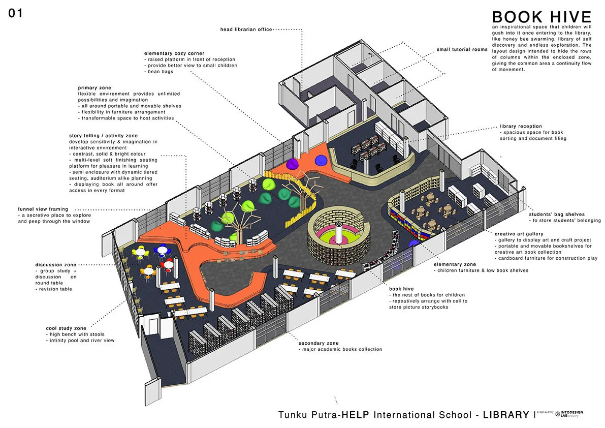
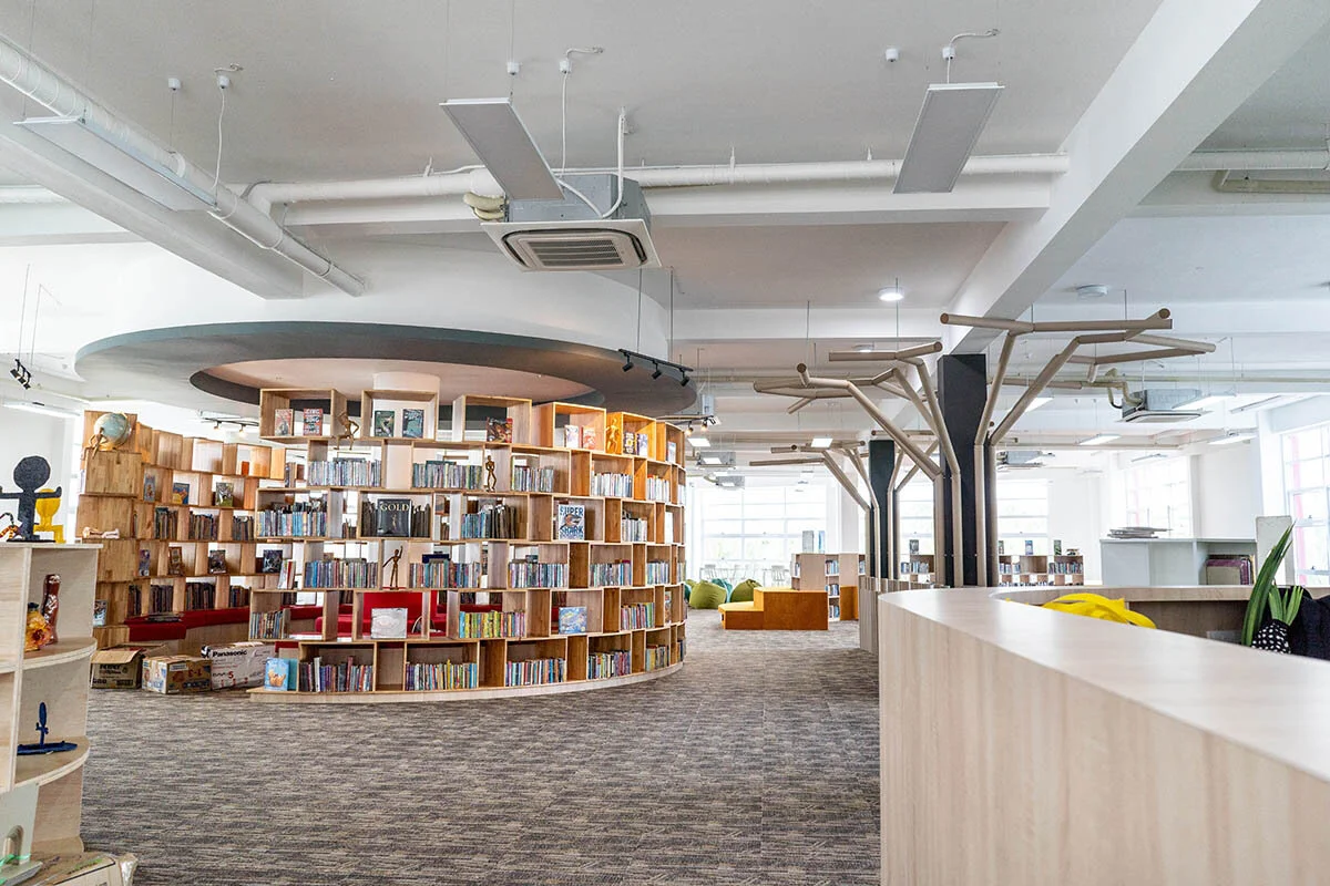
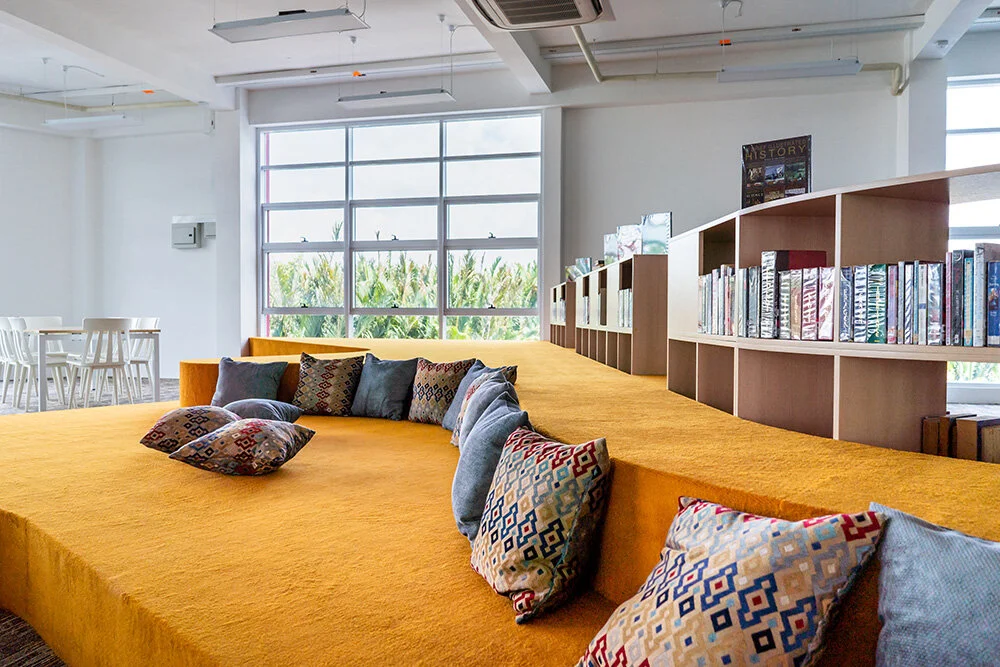
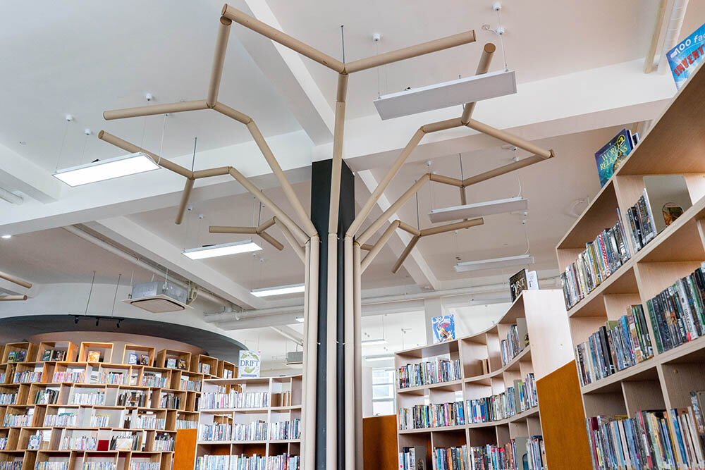
An inspirational space that children will gush into it once entering the library, like honey bee swarming; library of self discovery and endless exploration. The layout design intended to hide the rows of existing columns within the enclosed zone, giving the common area a continuity flow of movement.
The coffee kiosk functions as a mobile urban intervention onto the surrounding landscape. By installing the kiosk around trees, coffee waste generated could nurture the plants in return for shade. The kiosk could be moved from tree to tree throughout the site to give back to nature.
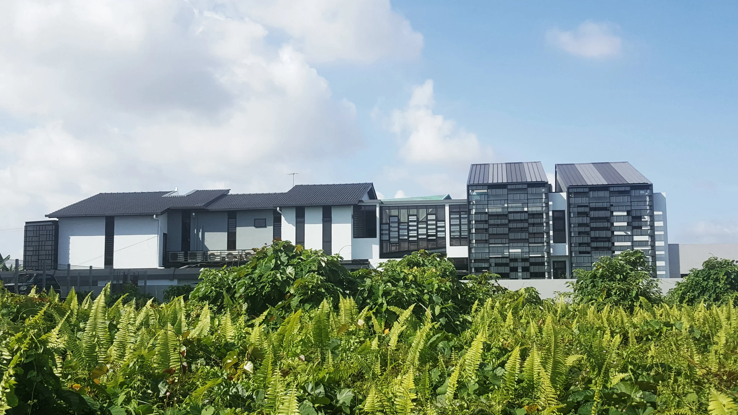
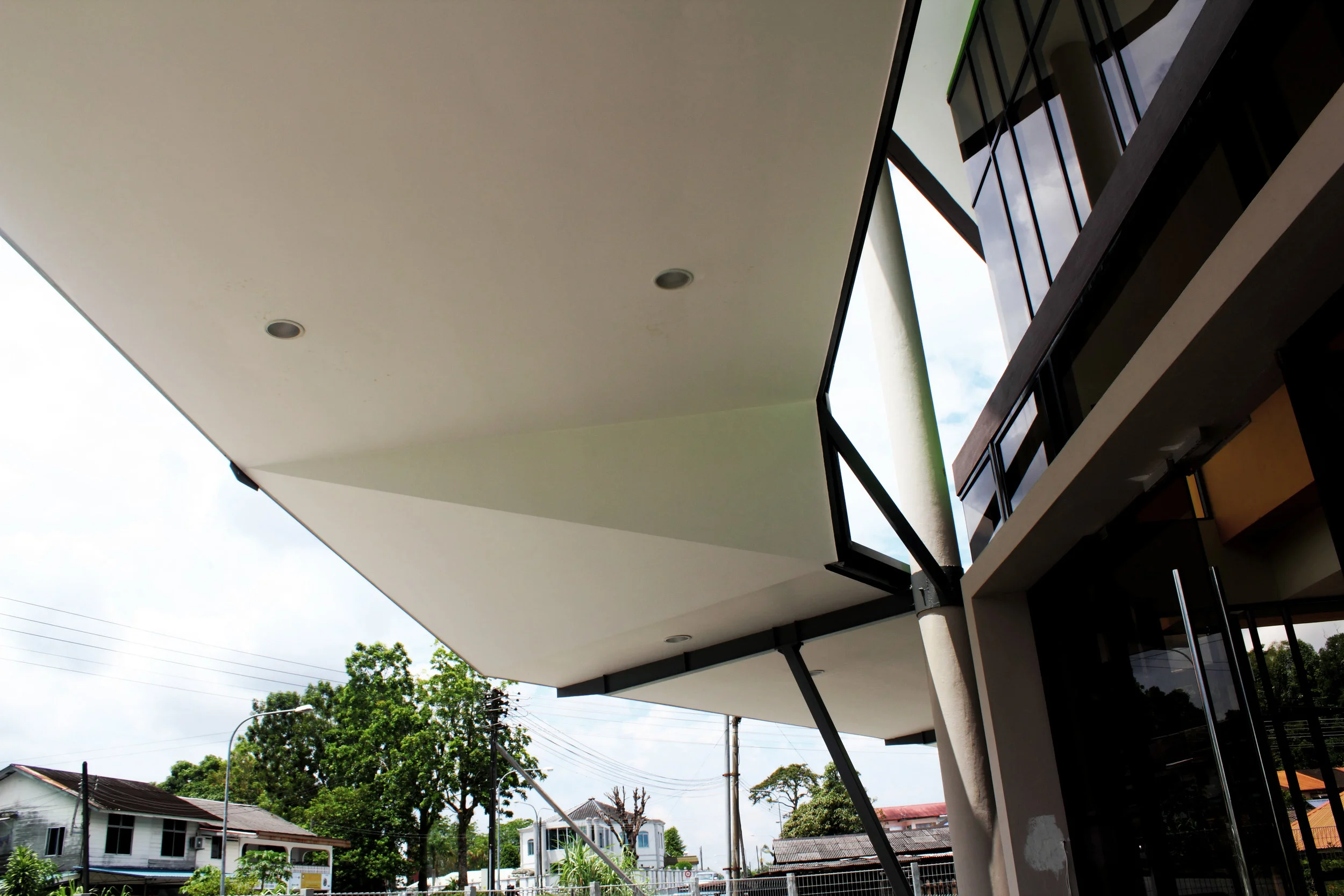
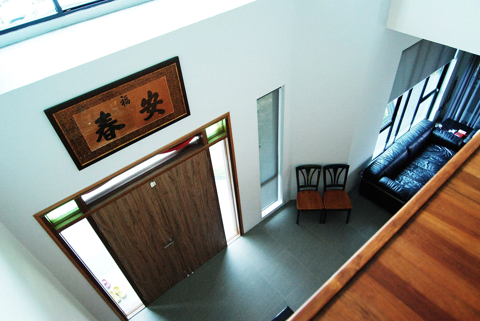
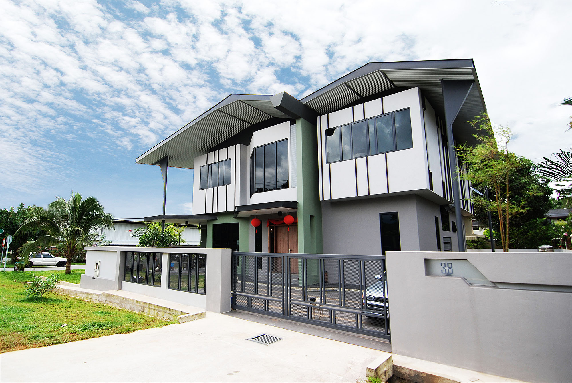
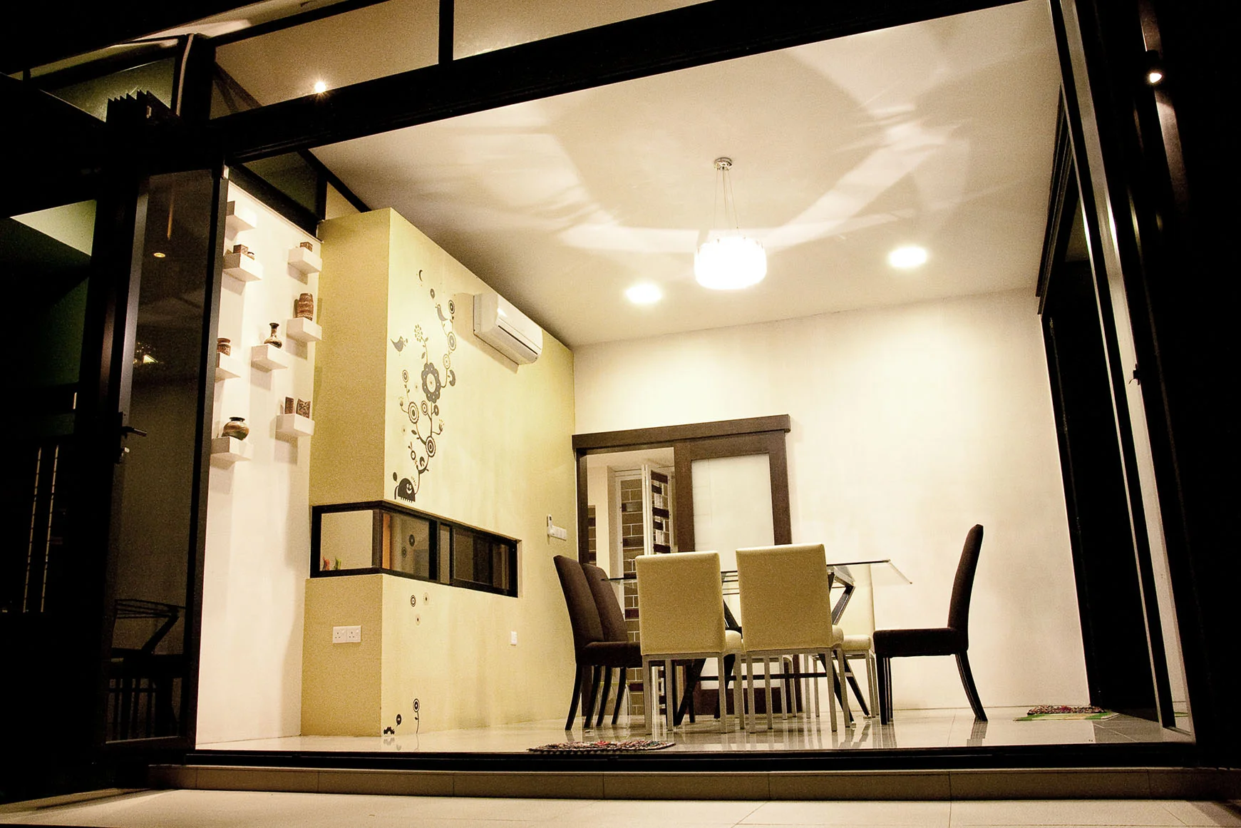
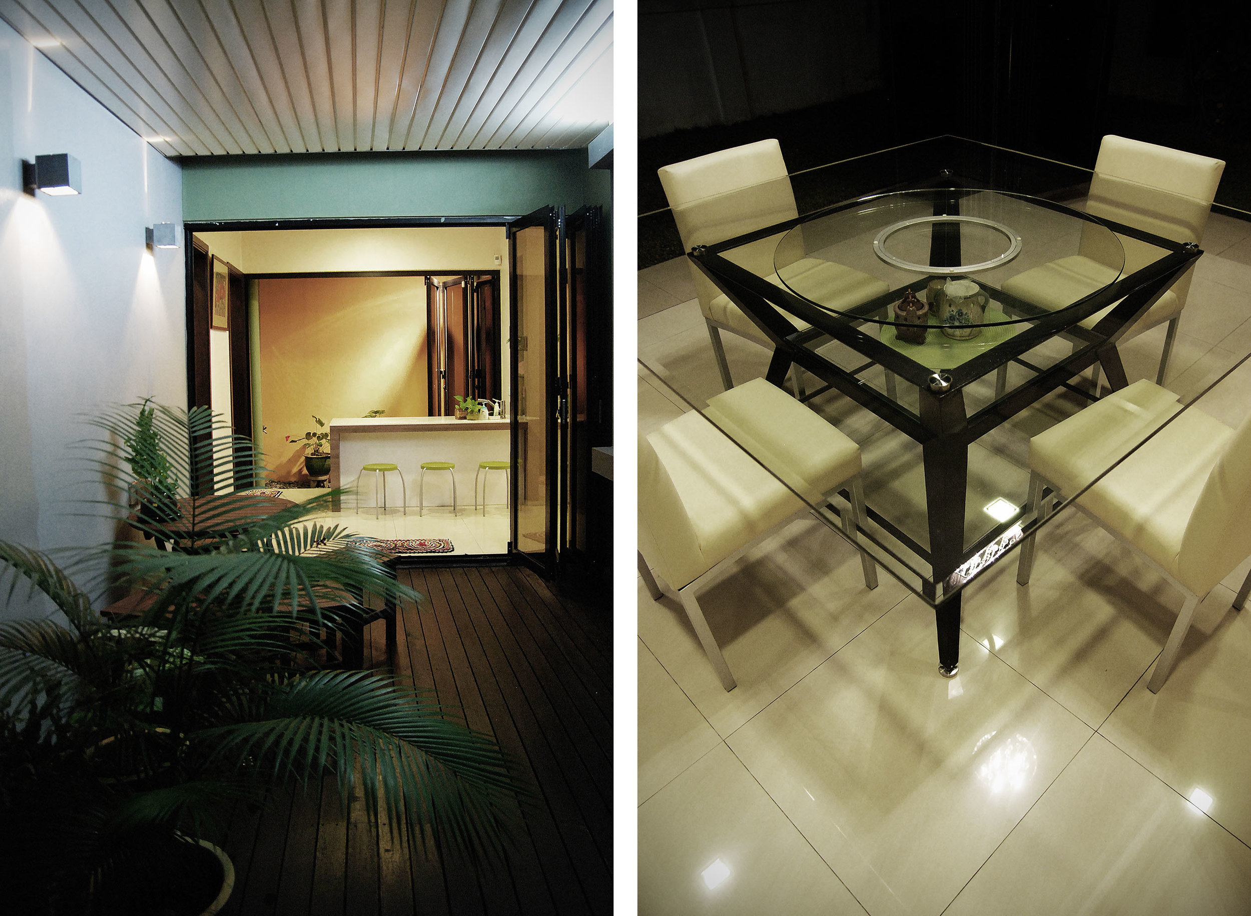
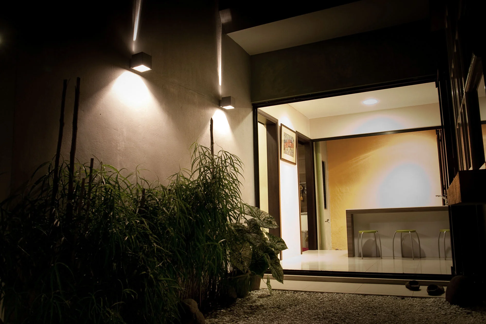
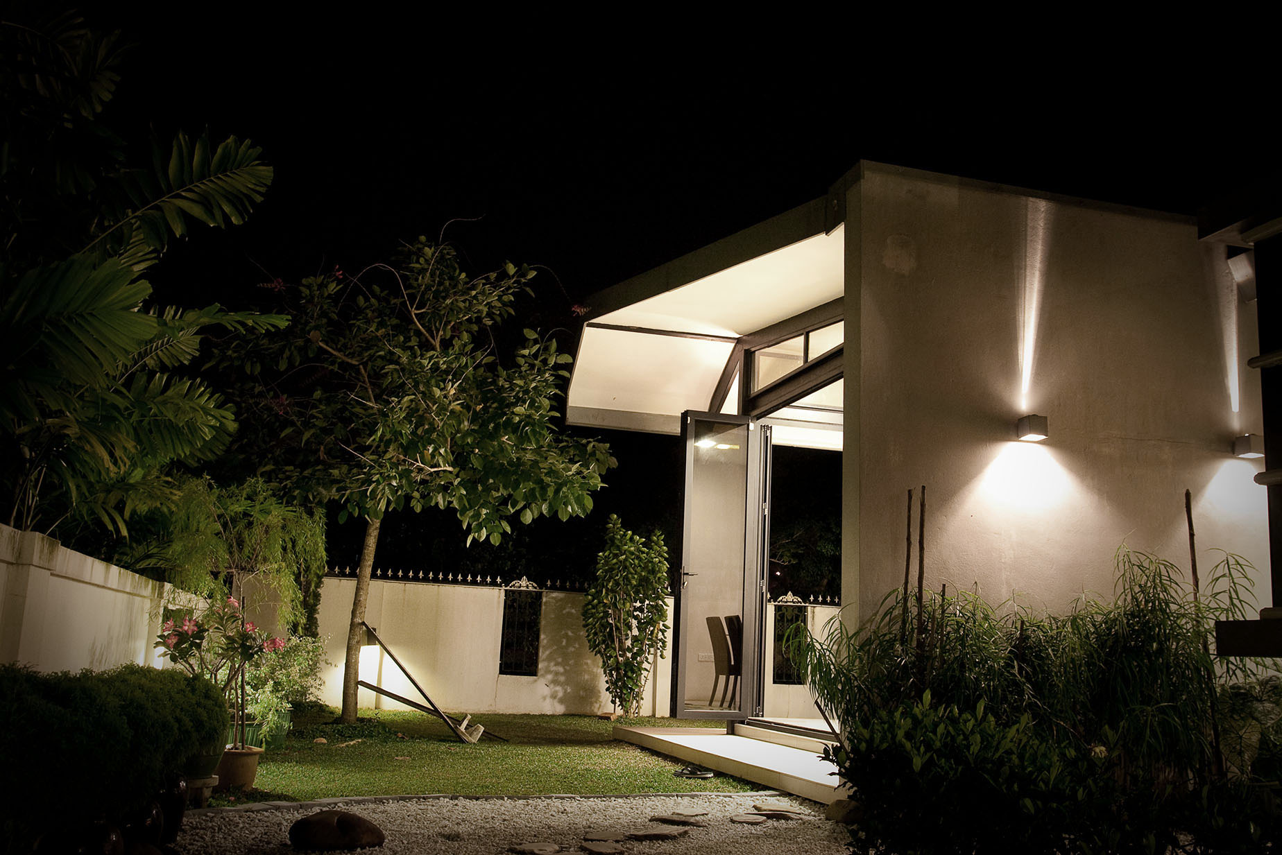
This is an extension to a detached house in Kenyalang Park – built in the mid-1980s’, with a linear plan due to its elongated site. The existing house is located on the middle of the land and was originally the site of their seafood business until a few years ago when the business moved to larger premises. With the back yard vacated, the original owners (the grandparents) wanted the house extended for three generations to live together.
The architect used two strategies to design the new house; the first was to maximize the build-up area without sacrificing natural lighting, ventilation and comfort. A planted courtyard garden and pool provided the relief space between new and existing – defining the link where the new house is ‘plugged in’ to the original house. The second aim was to synchronize the overall form of the old and new house. The extended house was designed in the manner of a modest steel shed with metal roofing material in the memory of the original cold storage sheds in the backyard.
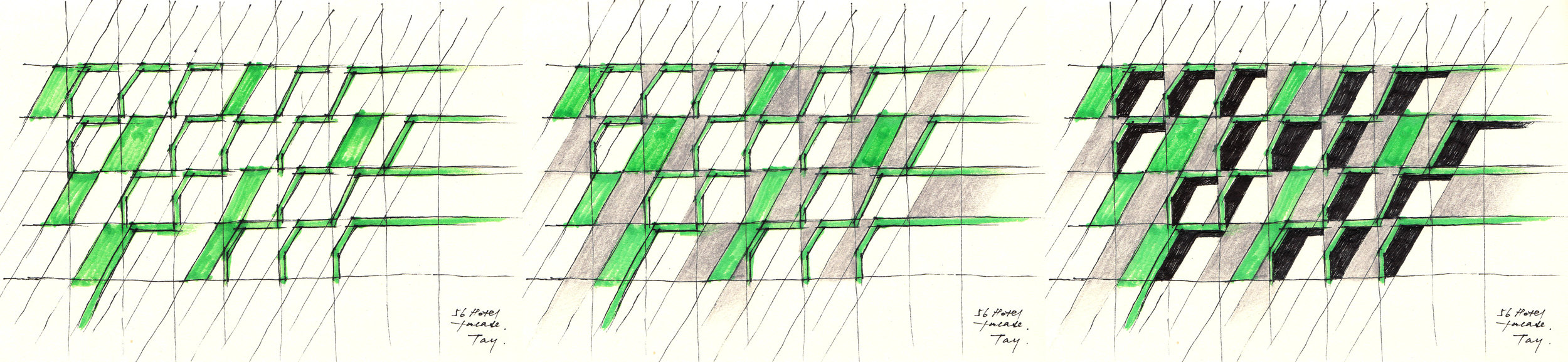
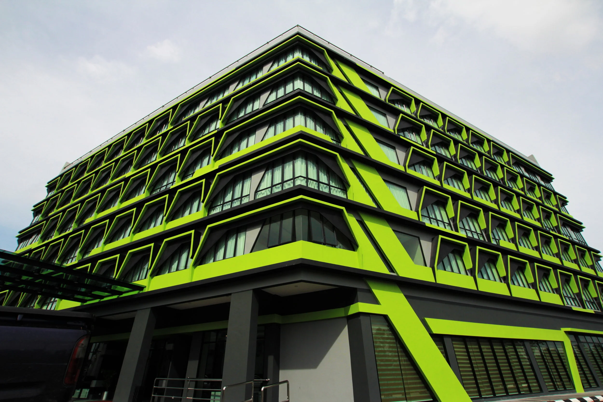
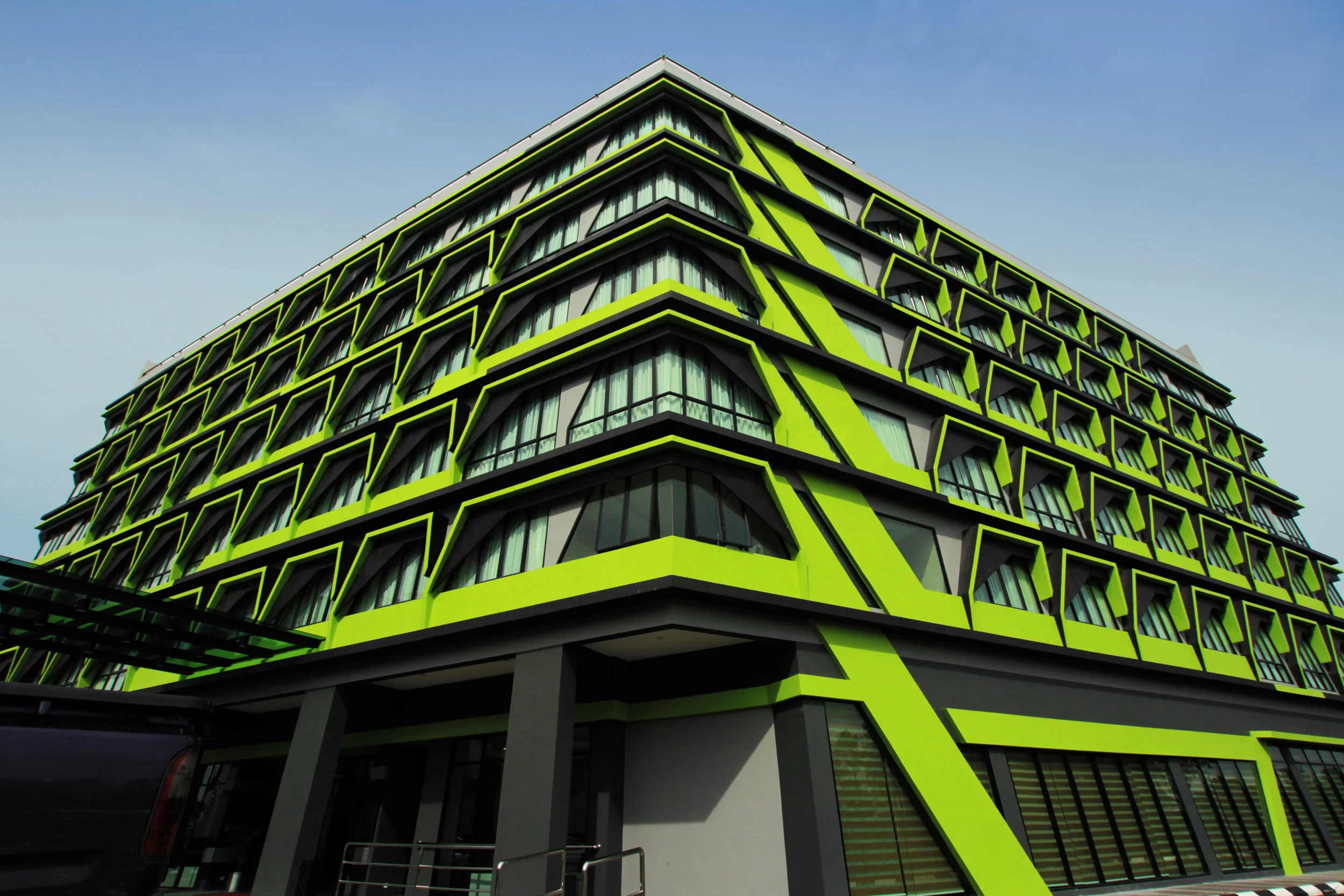
'A hotel in Sarawak seeks to distinguish itself with an architectural approach that is influenced by unique geometrical patterns found in the beaded accessories of Sarawak's local tribes.'
(Architecture Malaysia Vol 25 issue 3 2013)
A façade-oriented design, this 6-storey business hotel was planned efficiently to house 155 guest rooms at a less than optimal site. The ground floor consists of a lobby, cafe, business centre and conference rooms. From the first to fifth floors are the guest rooms. By adopting the hotel’s corporate identity, the architects transformed the hotel’s two-dimensional logo into a threedimensional envelope, through the anatomy of facade components that were placed in layers to create a distinctive look.
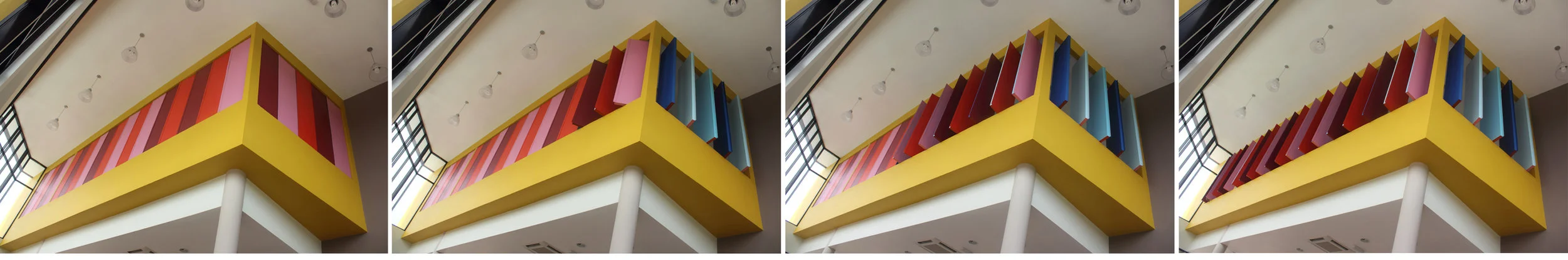
The site features a lower platform, behind rows of commercial blocks, and faces a major hightraffic road. The design approach employs a vibrant ‘pattern’ and ‘graphical’ effect with repetitive multi-faceted elements applied to the flat facade, which serves to create an attractive visual impact through the gaps and the alleyways between the commercial blocks. The design and composition of the facade components were developed and inspired by the Dayak tribe’s Manik (beads) artwork, alongside the hotel’s corporate identity. The indigenous people of Sarawak (Borneo) have used beads as part of their dress and artwork for hundreds of years, adding vibrancy and colour to formal occasions. Such craftwork employs the primary motif and secondary motif in contrasting bright colours, set within a dark or black background. All motifs are then repetitively composed to form the complete artwork. This technique was similarly adopted to develop the design of the facade. The exterior continuously extends into the ground floor lobby area, wrapping the ceiling and interior wall like a band that loops outside in. Interior touches such as floor tiles patterns, bench and ceilings in the cafe are derived from the process of composing shattered pieces of shapes into a directional distortion that forms the space. The outcome is a visually unique building that illustrates the culture of Sarawak through its architecture, making 56 Hotel a unique landmark that welcomes the visitors with its ‘cultured’ corporate identity.
PAM Awards 2012
Showroom Category - Shortlisted
'This office building is inspired by the parts and components of automobiles, reflecting the owner's nature of business.'
(Architecture Malaysia Vol 26 issue 1 2014)
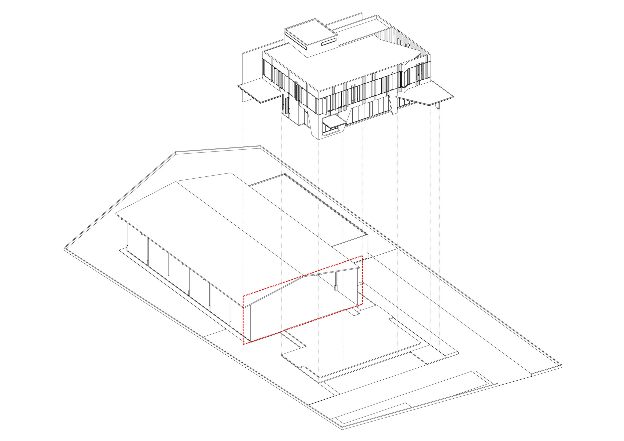
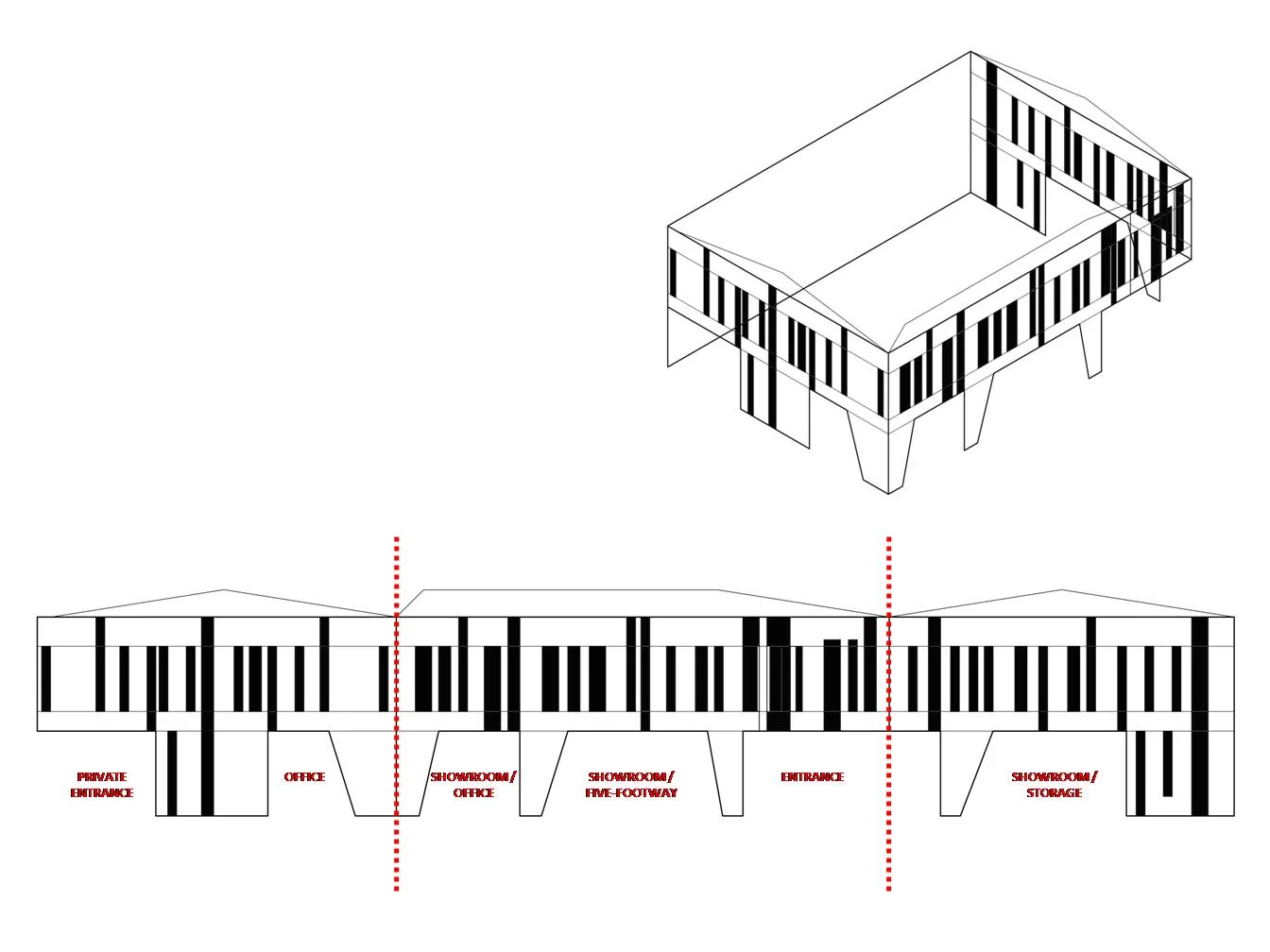
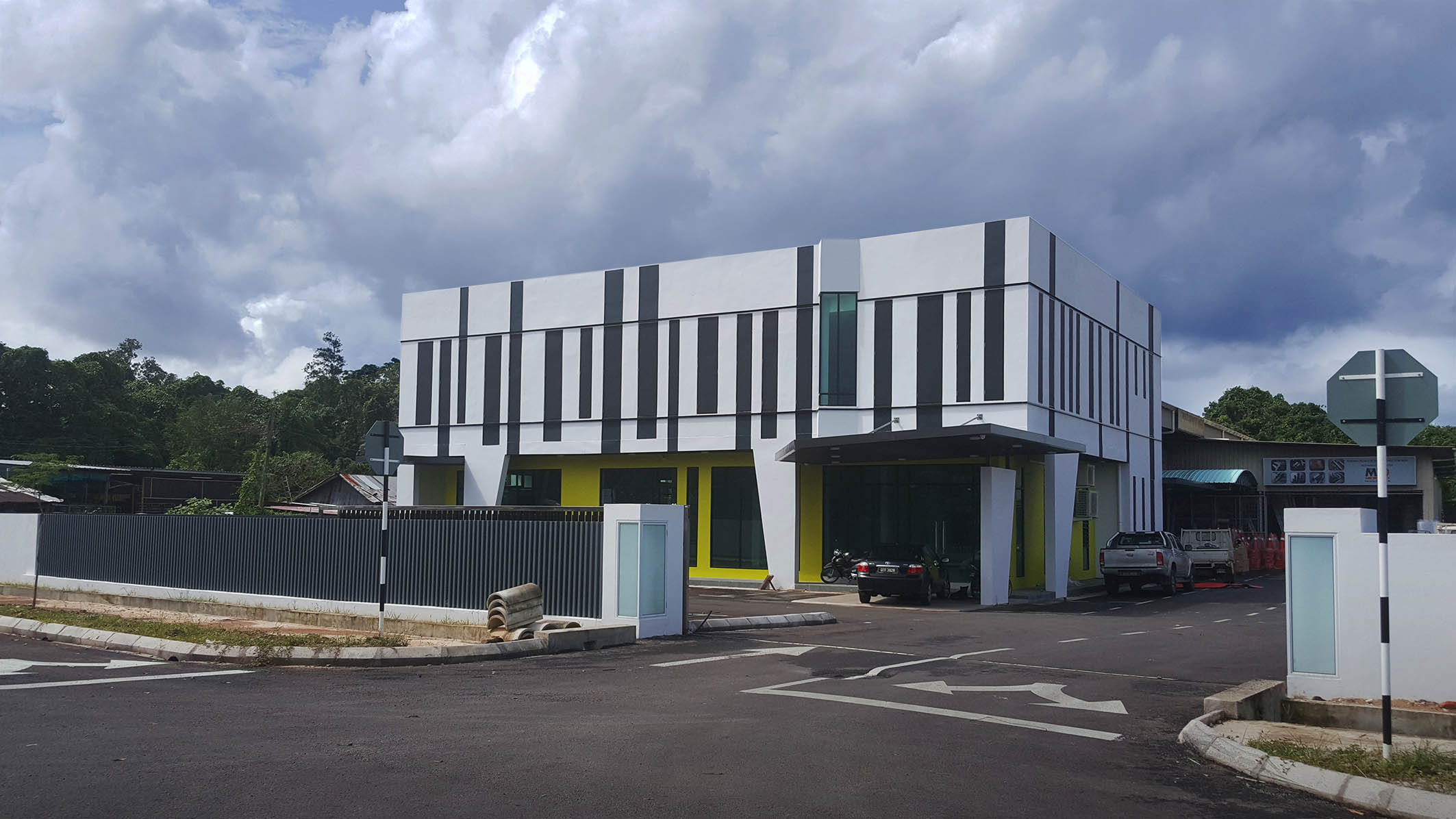
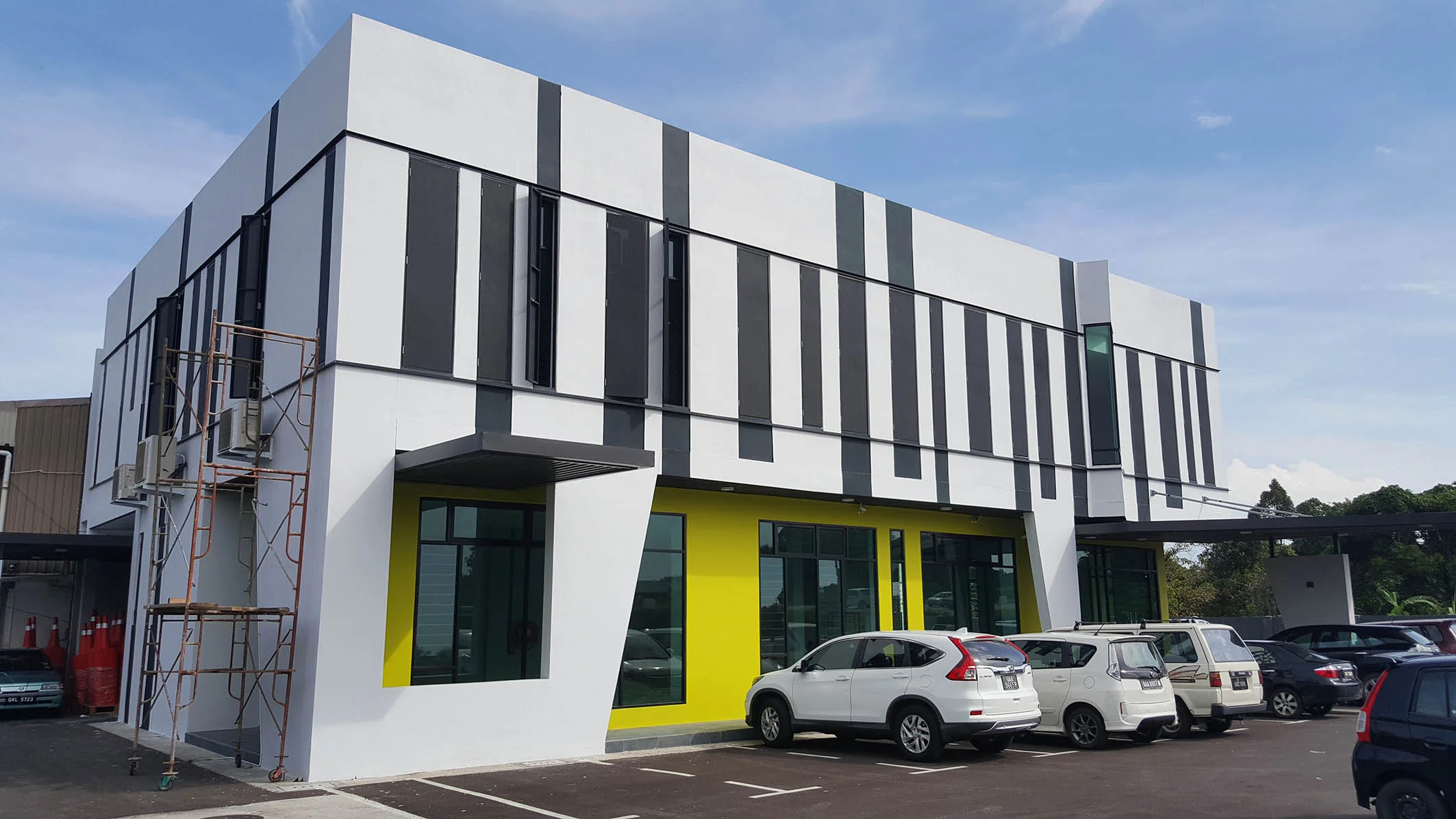
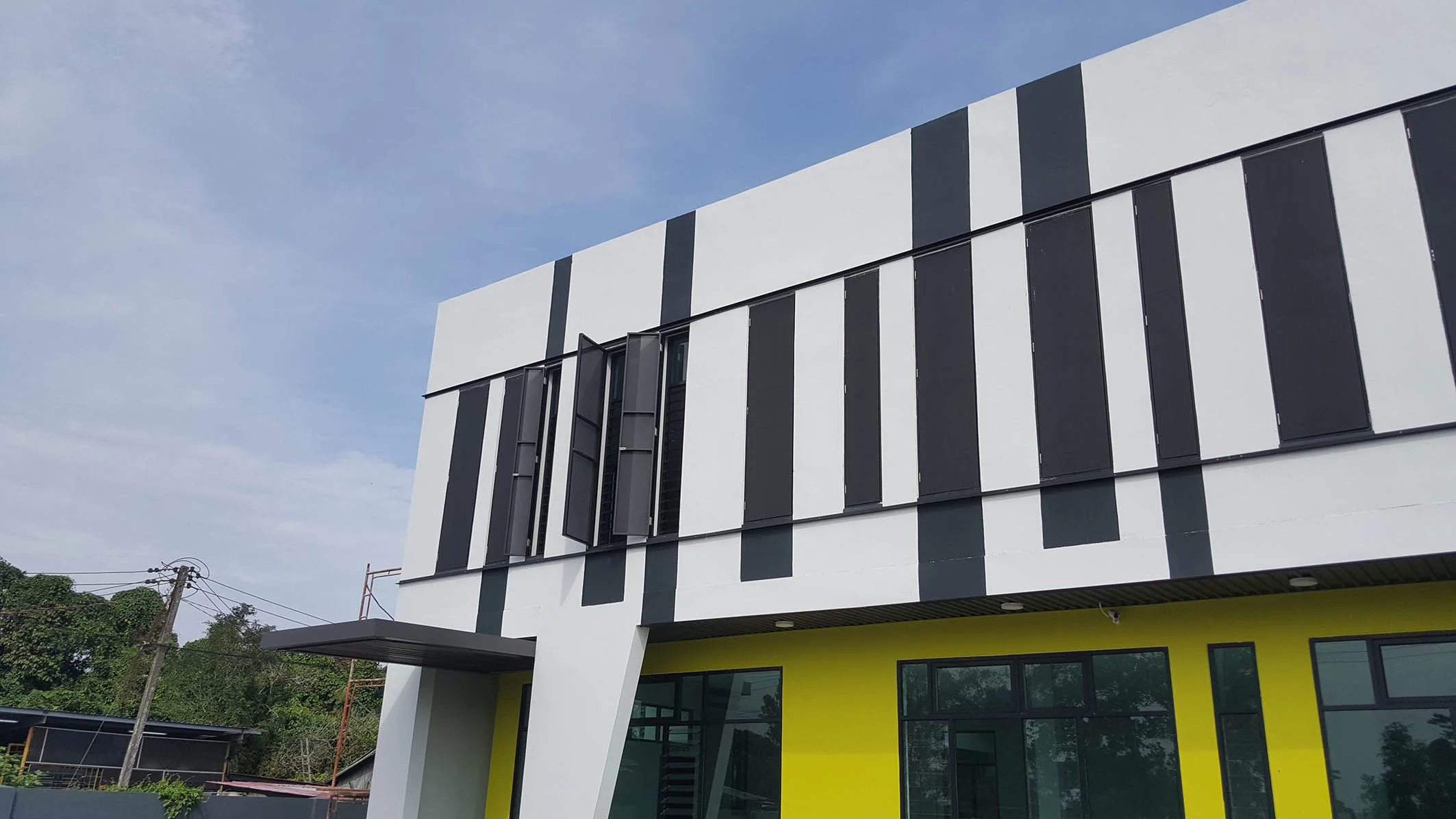
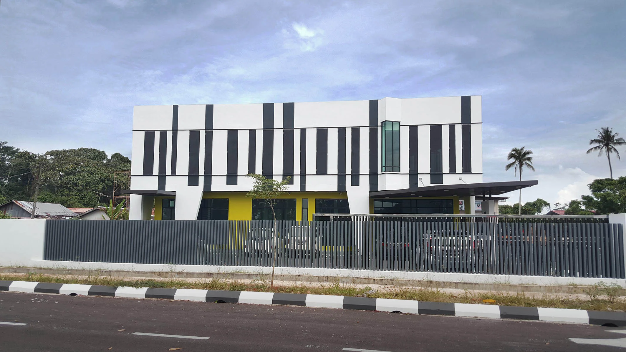
The building, Hiap Ho Paints Centre, is a privately owned 3-storey showroom-office building that serves as the client’s headquarters to showcase automobile painting products, materials, paint mixing processes, as well as to provide for ample storage space. The building represents the fulfillment of the client’s dream to own their own building for the expanding family business. The ground floor of the building comprises of a customer service foyer and pantry, which can be converted into an event showroom at the front facing facade, leaving the back of the ground floor as storage space. The operation office, director rooms, mixing and toner rooms occupy the entire first floor. The second floor is dedicated to the meeting room, seminar room and auxiliary storage spaces. The building also incorporates a roof garden that allows for panoramic views of its surroundings. The site is surrounded by low-rise residential housing and 3 churches that have become well-known landmarks within the area. As such, the building was developed from the context of ‘Churches as landmarks’ and designed to continue as an additional landmark along the streetscape. Architecturally, this Paints Centre contributes to its surroundings as a ‘Cathedral of Colour’ of sorts, either by its colour scheme or built form, which is meant to enliven the streetscape. Sited on higher land in comparison to its surroundings, the building has stood out outstandingly as a landmark from afar, within its humble and quiet surroundings. Additionally, the building was intentionally designed to be an ‘advertisement piece’ by itself, enhancing the commercial value for the client. The form, inspired by parts and components of automobiles, reflect the client’s nature of the business. This is achieved with angled glaze openings and the continuation of the building’s silhouette by using 2 dimensional super-graphic inputs to enhance 3 dimensional visual effects from 360 degrees. The second floor space is visualized as a floating object, creating a distorted effect for onlookers as they drive by. The left and right facades are mainly solid, to highlight the
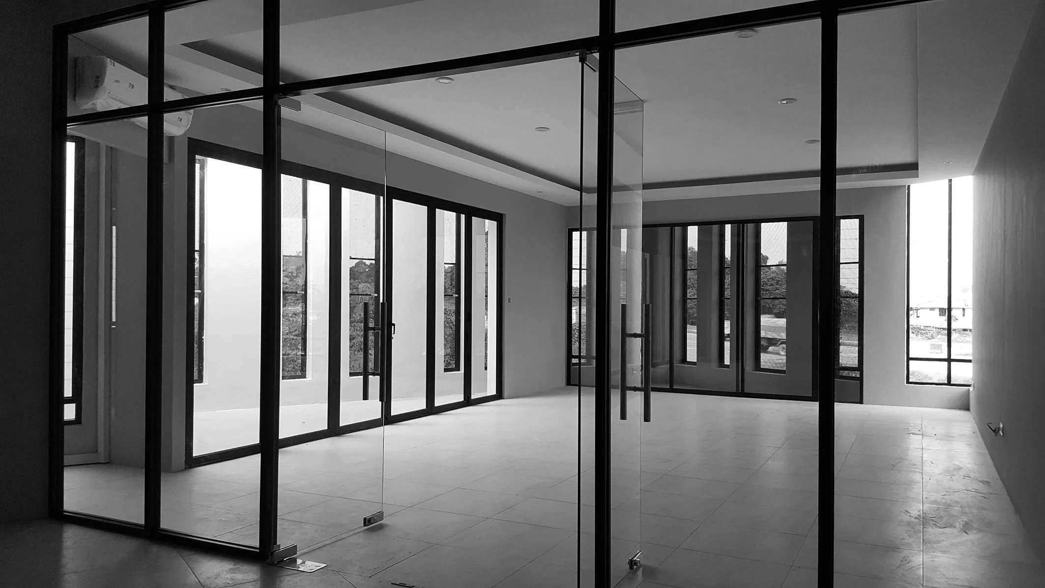
lightness of the front facade. In addition to the different gradients of natural day lighting externally, the building emerges as a combined piece of art, architecture and product. Working within budget constraints, construction materials and methods are typically conventional, with a reinforced concrete structural frame and brick wall construction. However, these restrictions did not limit the design of this project in terms of architectural exploration and expression. The client’s brief requested for the built-up area to be maximized. The design also sought to reduce the building’s heat gain, with the second floor’s deep overhang shading the ground floor from sun and rain. The first floor has been further recessed from the envelope of the building, leaving a double volume space for more airy and welcoming foyer. Lastly, the interior was designed with unique details such as the specially detailed pivoted two-face panels, which serve as a giant colour chart to suit to the nature of the business. These panels can act as advertisement panels or as solid partitions for privacy, and is used to change the mood and colour of the ground floor foyer easily.
'Skillful use of architectural elements, exciting spatial experience and vibrant colours demonstrate the approach and notion that learning can be accommodated anywhere and anytime on campus.'
PAM Awards 2017
Education Category - Silver Award
'A dynamic, flowing spiral loop ties together inspiring learning experience for the students of Eaton International School.'
(Architecture Malaysia Vol 29 issue 5 2017)
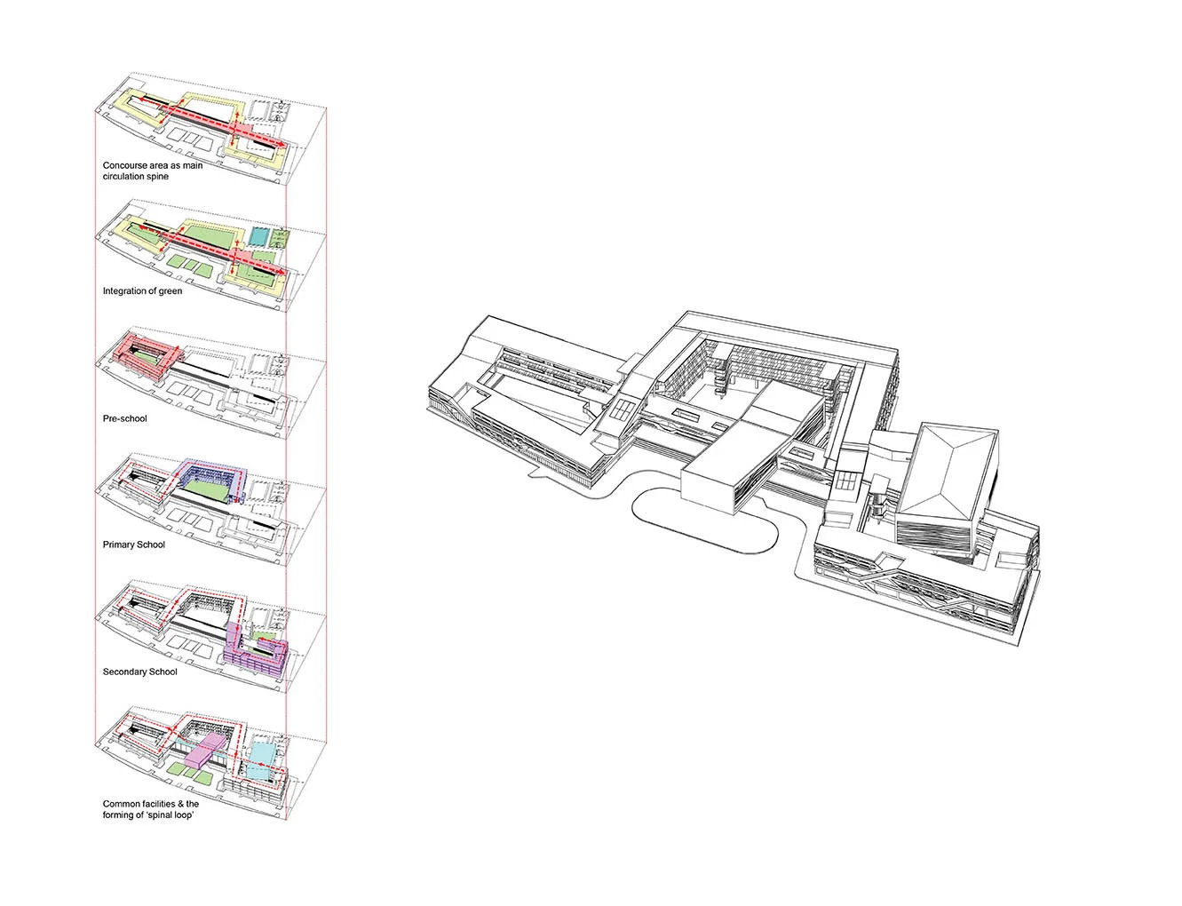
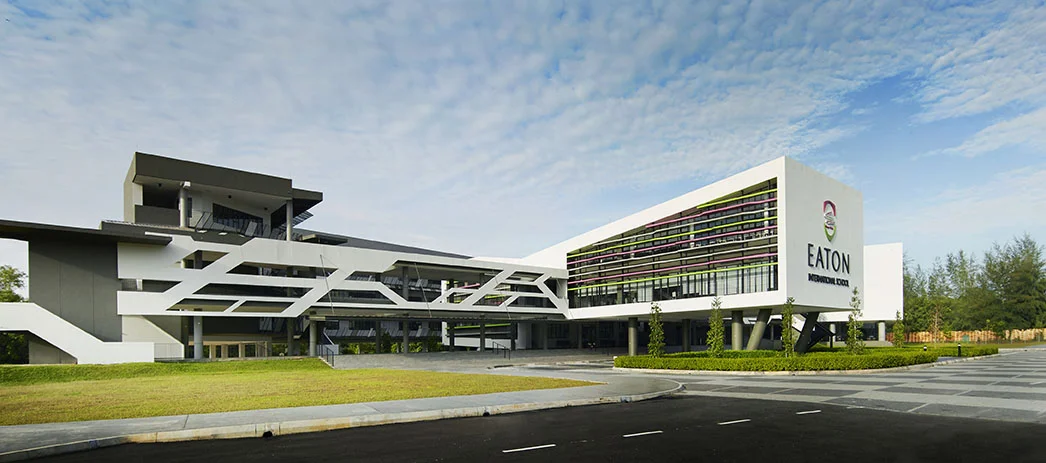
Eaton International School is located in Jade Hills, Kajang. The School’s built-up area is 138,685 sq ft (Phase 1) and consists of classrooms, academic and non-academic administrative wing, and main facilities such as a library, canteen, multi-purpose hall and black box performance centre. The three programs of the School are pre-school, primary and secondary education. The building was completed in time for the School’s new semester in September 2016. Phases 2 & 3 is targeted to be completed in 5 years’ time, and will increase the building’s total built-up area to 205,600 sq ft.
The architecture captures the Spirit and Vision of the School, with spaces that are inspiring, stimulating and enjoyable. The dynamic and continuous ‘spiral loop’ building form reflects that learning is a continuous, never-end process. The ‘spiral loop’ wraps around 3 courtyard spaces and embraces the external within the internal. This blurring of the boundaries of the learning environment expresses the School’s philosophy that learning can happen anywhere and at any time, whether in the classroom or outdoors.
The Main Concourse is the ‘spine’ that connects the three programs of the School. The Main Concourse forms the activity hub of the School. The academic and non-academic administrative wing and main facilities such as a library, canteen, multi-purpose hall and black box performance centre are all located along the Main Concourse. A flight of steps cascades down from the Main Concourse to the Central Courtyard and opens out to the future sport facilities, which will be constructed under Phase 2
The architecture also adopts green environmental design strategies. The building is designed with single-loaded corridors that allow for natural cross ventilation through the internal spaces. Classrooms and library have large openable glazed openings that are shaded with colourful feature hoods. These shading devices filter the penetration of natural daylight and reduces glare and heat built-up, creating comfortable a learning environment. Open corridors wrapping around the courtyards are well-shaded with perforated metal sun-screens that provide screening against rain and external weather.
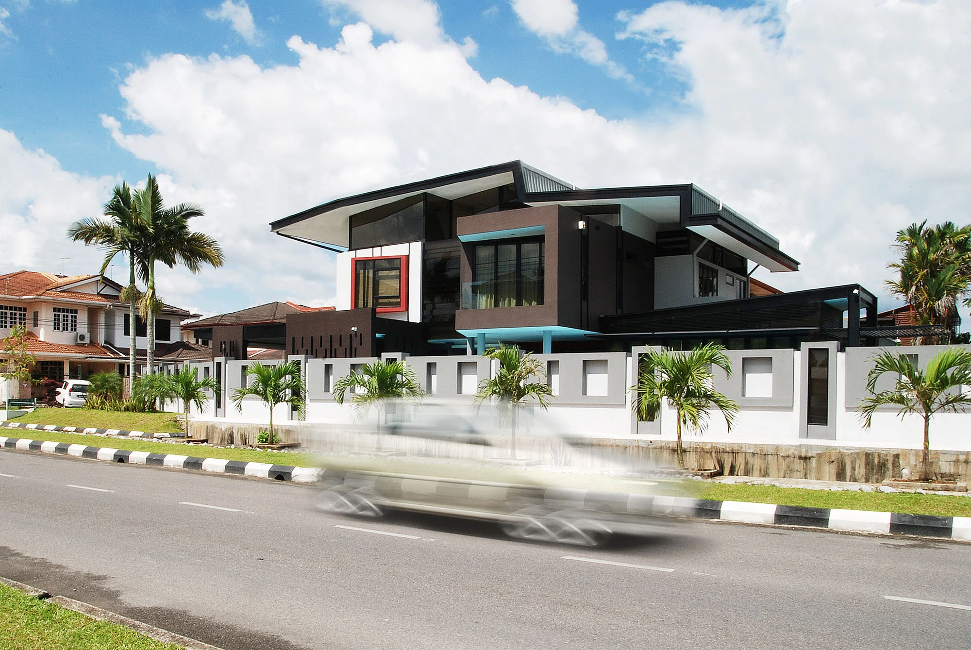
The existing house is a typical corner lot semi-D with plenty of open compound. The client has purchased the empty lot behind, planned for alteration and extension to the existing house and fully utilised the compound. Most outdoor compounds were under-utilised due to tropical climate condition and owner disliked heavy maintenance to landscape. He is quite keen to extend the house for family of 2 adults, 3 grown up kids and a maid, yet maintaining a reasonable size for his wife to take care.
Spaces required include a clubhouse for leisure facilities for occasional gathering and party with friends, separate access and additional car parking for guests without interrupting private living of the family and an additional 1 room on the 1st floor and all rooms with detached bathroom. The client also requested that the house would look like a detached house. With his strong-will to remain staying in the neighbourhood yet own an identical house among the typical housing architecture, the project is attempted to challenge the typical Semi-D prototype. Also is about making a statement or milestone for the client’s discovery of life and taste from a “Kampung boy” to a successful businessman who gained lots of exposure by travelling.
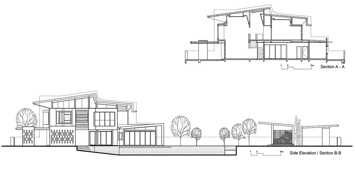
This overall building form mimicry the Gunung Serapi, a well known geographical landmark which can be seen from most area in Kuching. Adopting the same approach, this house is intentionally designed as a landmark with an injection of nature element along the streetscape.
The roof design has been carried out through a process of testing and combining different roof profiles exist in the neighbourhood from 80’s to 90’s. The roof is oriented with visual angle directed towards the traffic approach from the main road. With that, it is all about attempting to give the community with some reminder or imagination about the mountain intentionally and unintentionally.
The side elevation is treated to enhance the visibility and attention significantly while the north and south entrance to the house have been treated carefully for not overwhelming the side facade facing the main road. On the 1st floor, more unexpected perspective angles will be previewed and the massing is appeared as a floating object with distorted effect from scenic drive through experience from two directions along the main road.
Most spaces and circulation was designed to adhere to the existing living style and familiarity without much adverse impact, and the total built-up area is kept within 15 percent increase. On the ground level, a double volume space is introduced to improve natural lighting in living room. On the 1st level, ceiling follows the roof profile with pockets of high windows all round to lighten up the hallway.
Interactive semi outdoor areas are extended onto the compound, linking with pool on the west and teahouse on the north end. These leisure spaces tend to improve visual connectivity and spatial relationship between indoor and outdoor yet separating the family zone and the guest zone.
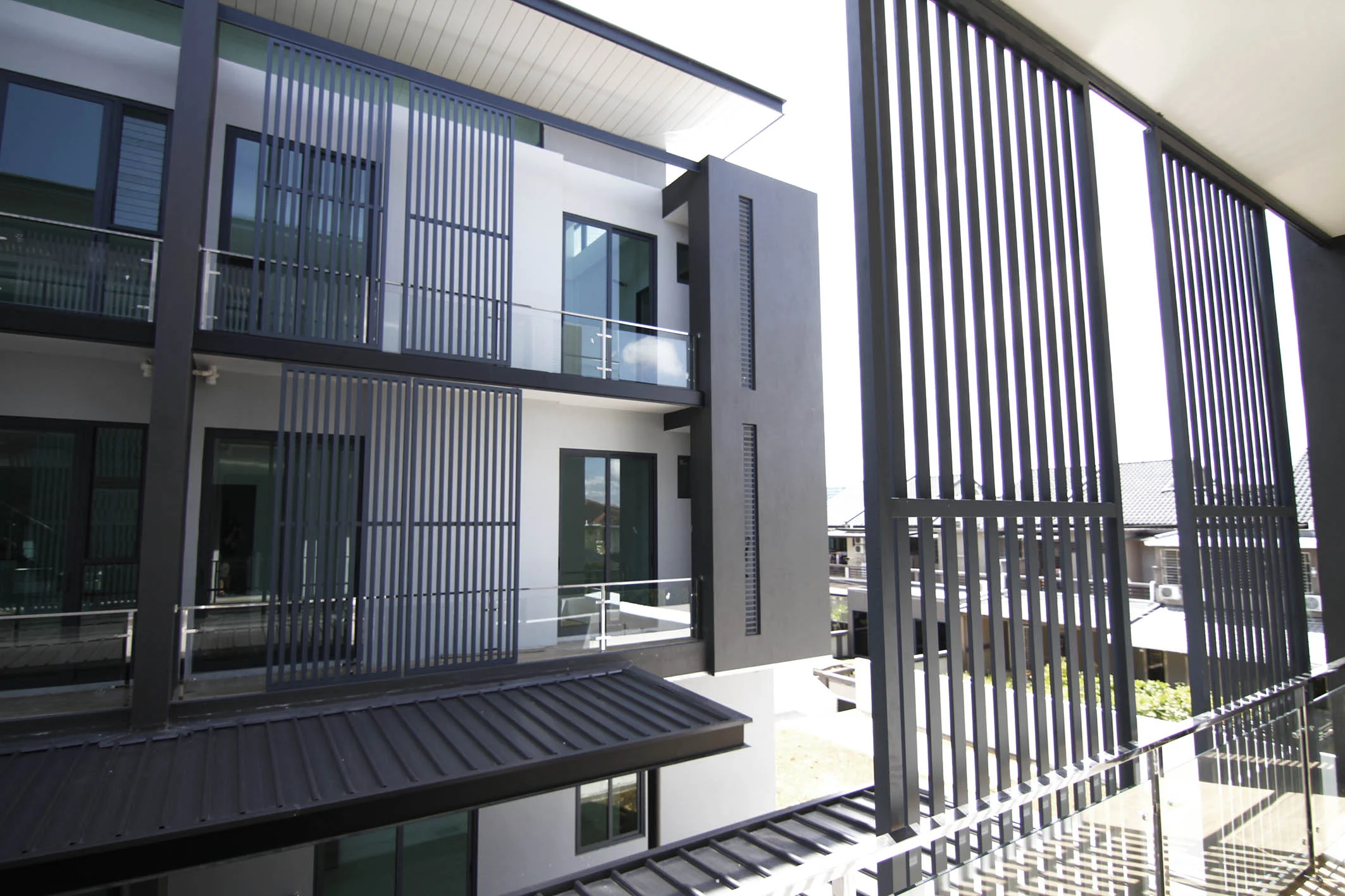
Colours were chosen to highlight the plasticity of the components, continuity of layers and surfaces; black linear strips on facade and black window frames as primary elements of the facade, that reminds the facade treatment of the black and white house mansion.
We envisioned the house that is free from association with the typical Semi-D along the streetscape. sThe facades are components of volumes purposely extruded from, and seen as gliding past one another. This enabled the provision of balconies and pocket window.
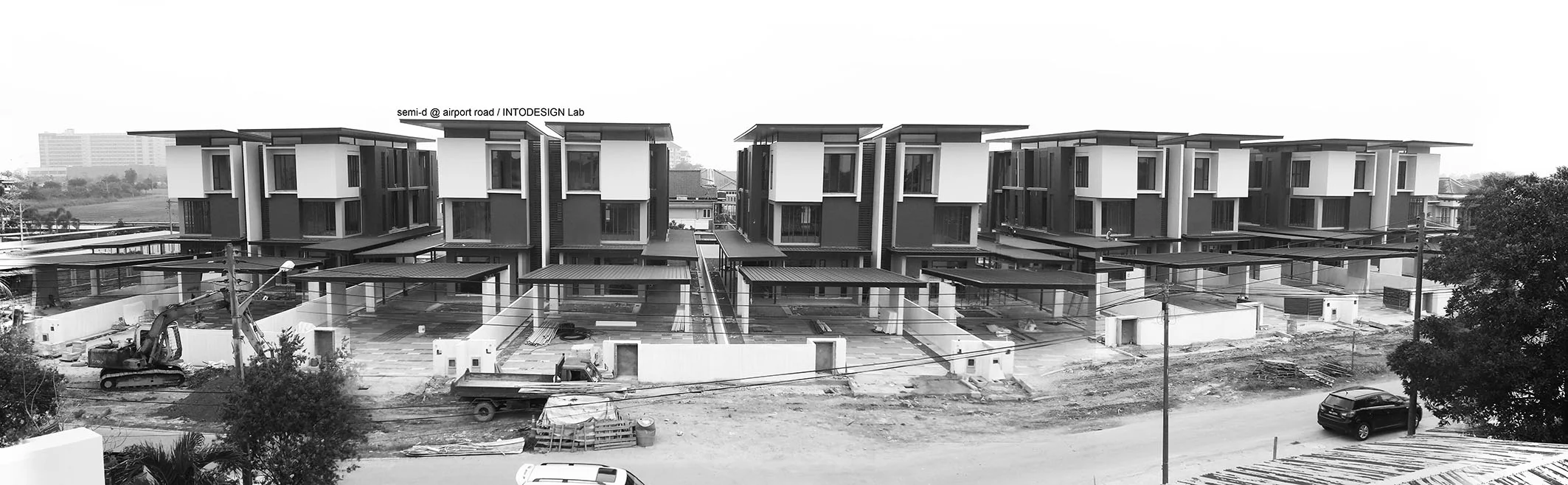
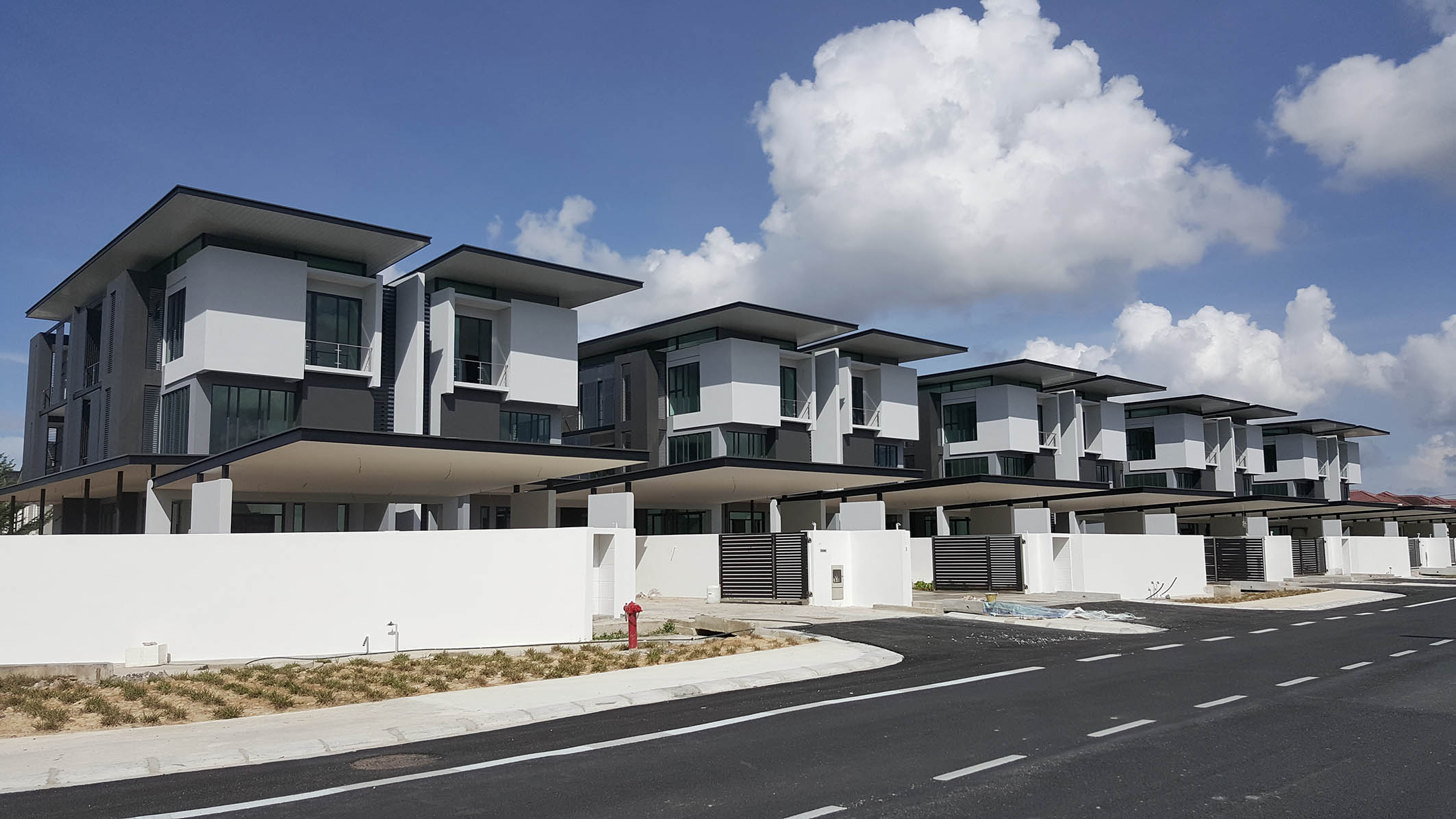
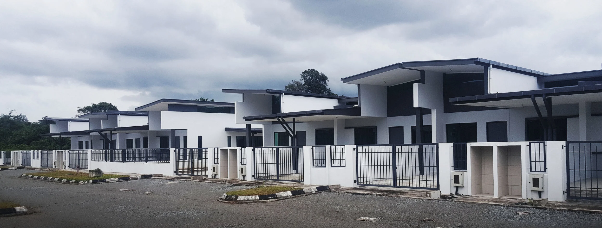
The exclusive 10 units of 3-storey semi-detached housing feature formal and contemporary design. It sets directly beside the neighbourhood of modern residential and commercial area at the Airport Road, and within the close proximity to the Kuching International Airport, offering a clear and panorama view of the adjacent airport and neighbourhood.
‘Keeping the family roots alive through memories from the past.’
(Home Concept Megazine, Jan/Feb 2013)
The ‘Sim-sons’ House in Kuching, originally built 80 years ago, has been home to three generations of the Sim family. This inherited home, although demolished and rebuilt to accommodate more family members and more modern amenities, once included an extension, which served as an automobile workshop owned by the family.
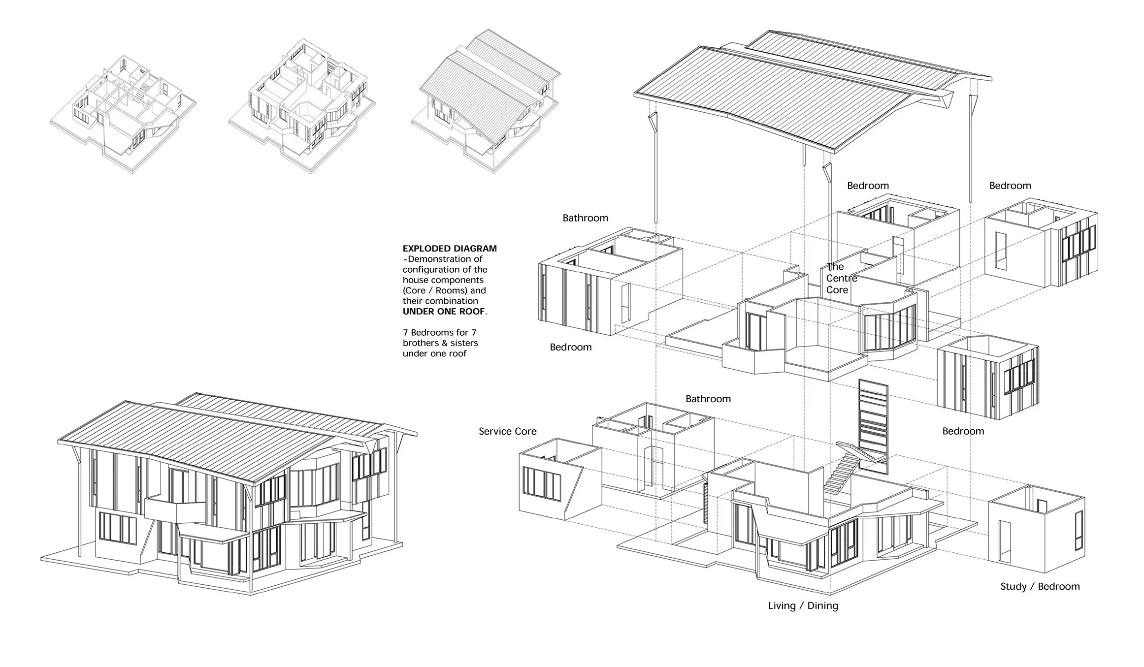
Today, this home has been transformed to a weekend house for the current generations of three sons and their families. Although the old wood and brick home had been ravaged by time and could no longer contain the large family, design element of the past were preserved and incorporated to maintain the originality of the home and as a mark of respect for the family’s past. To accommodate the large family, the brief was to create seven bedrooms, four bathrooms and two living rooms; the resulting home was planned out in a grid-like form to achieve a spacious feel within the total area of 3,200 sq. feet.
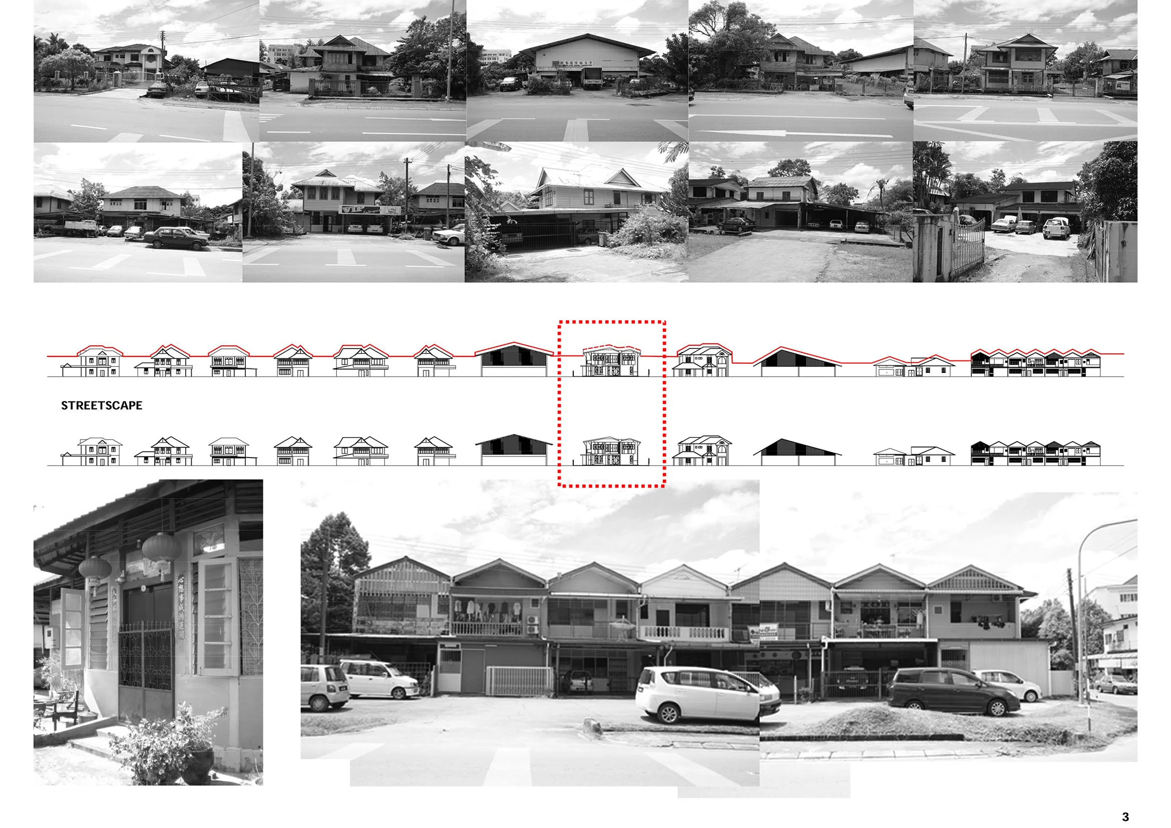
The rebuilding of the house was much like a process of reassembling remnants of the past for the owners, and effort were made to repurpose the existing timber from the previous house, to be reused as part of the new house. Apart from that, the architecture of the home not only traces the history of the family, but also reflects the relationship of the home with its surroundings, which includes houses built in different eras. Using some of the existing architectural elements of its neighbours such as roof profiles, gutters, downpipes, textures and colours, the Sim-sons House was reinterpreted with the modern approach that still celebrates the richness of the past and the local architectural style.
Another design element that was extracted and incorporated from the previous house included the adjustable horizontal aluminium screen panels at the staircase, a sight reminiscent of the horizontal timber that used to envelope the walls of the old house. At the same time the central exposed concrete gutter has been intentionally left to protrude at both ends, echoing the typical design in the surrounding residential area, and creating a more harmonious effect with its environment.
The home’s original circulation space was also maintained so as not to create a drastic change in the family’s lifestyle, and to imply harmonious living for the big family under one main roof, double the pitch roofs were used.
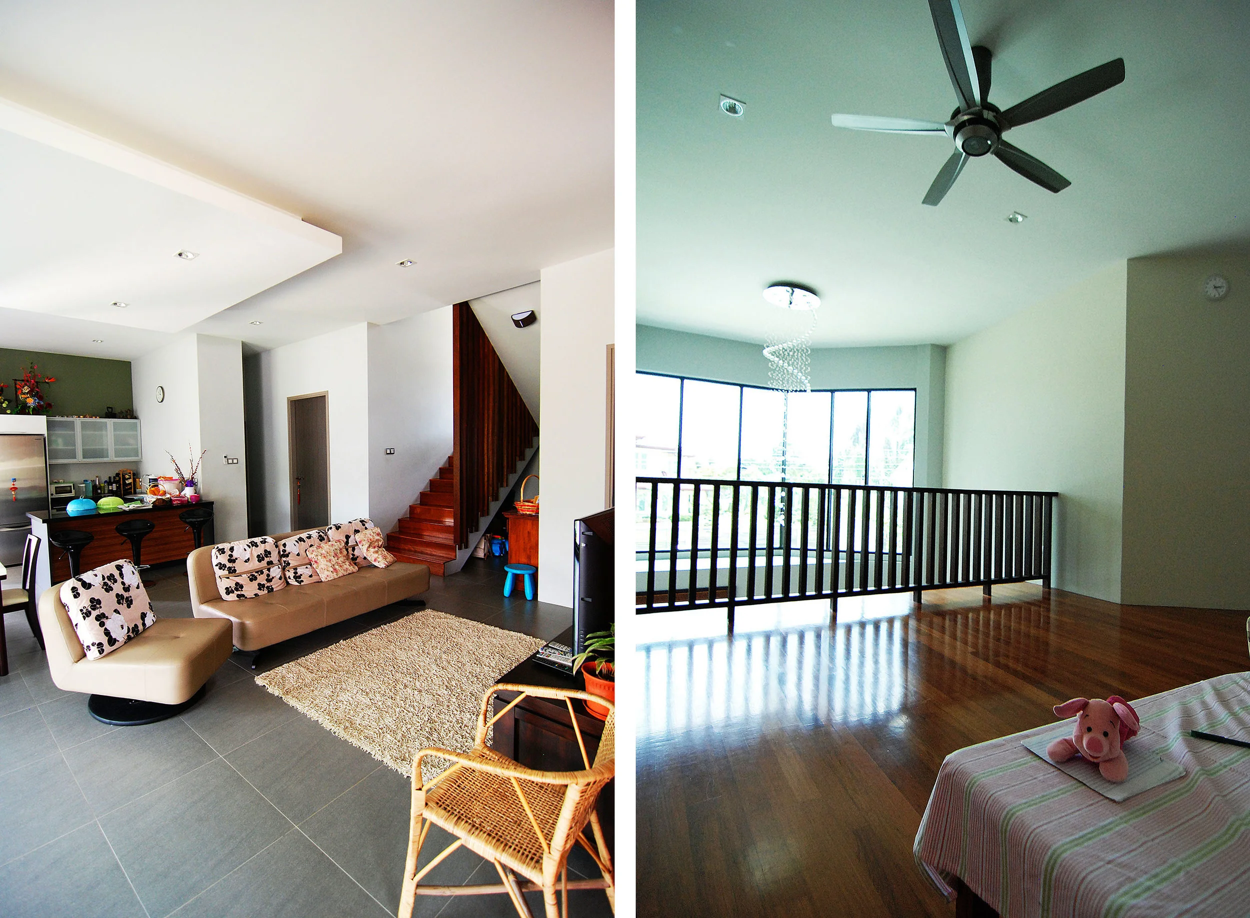
Internally, the ground floor is in tasteful contradiction with its exterior with its welcoming, open concept. In the daytime, the multifaceted walls help to cast an interesting play of light and shadows in the family’s gathering area. On the upper floor, the floor plan was maximised to fit in the most number of rooms while still ensuring there was sufficient lighting and natural airflow.
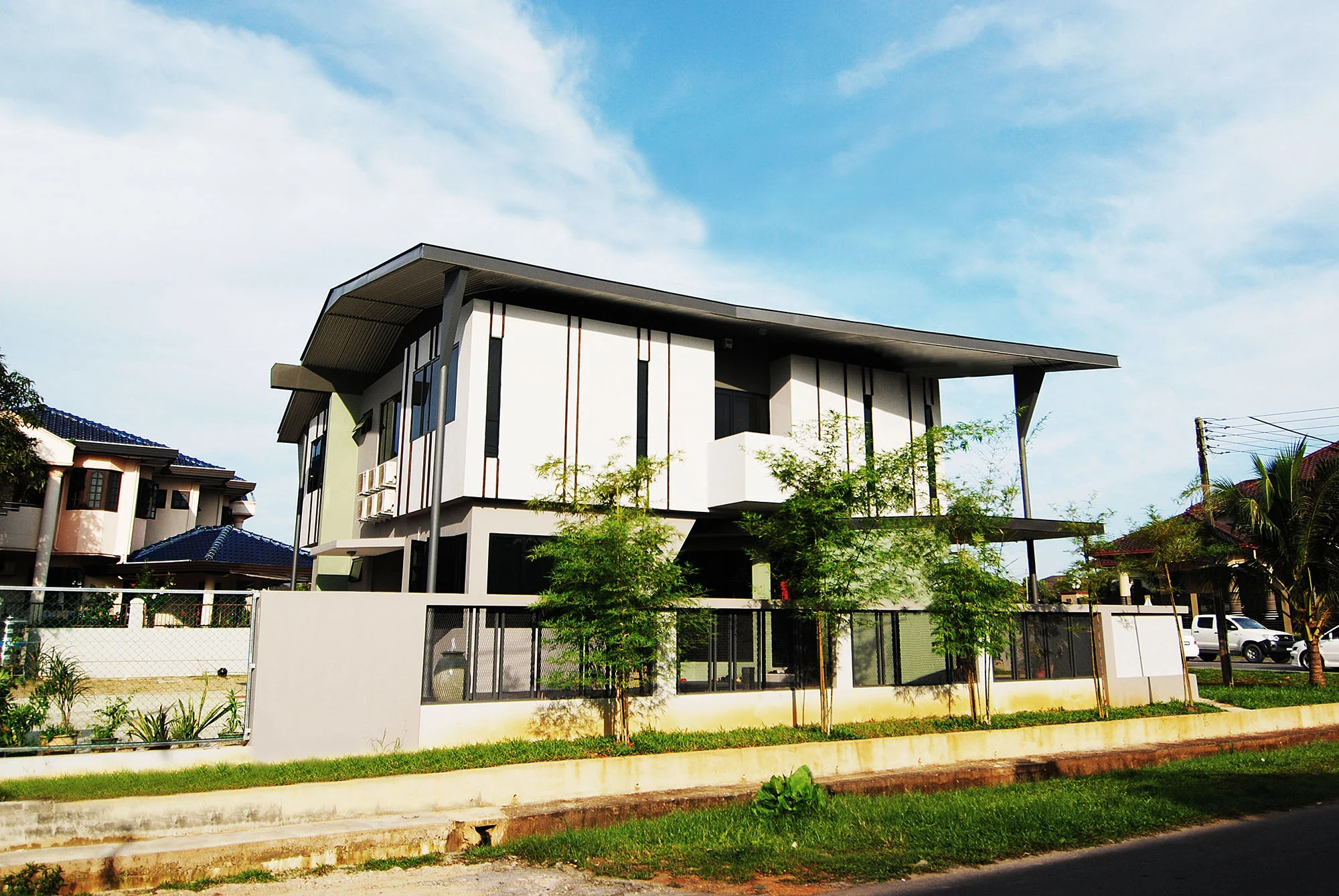
The result is a modest yet modern home that exudes a solid structure which is also firmly rooted in the past, with its foundation standing tall and proud. With its rich history and story, this contemporary family home has been uniquely preserve for the future generations of the Sim family.
A modern and affordable housing design that intended to break through from typical local single storey terrace and semi-detached housing typology by providing potentially expandable space based on the needs of owners and offering sense of individuality. The houses feature a modern frontage, spacious entry and high ceiling throughout that give the houses the proportion of a double storey home. A uniquely design that practically keeps its function and promote modern lifestyle in suburban of Kuching. (Under Construction)
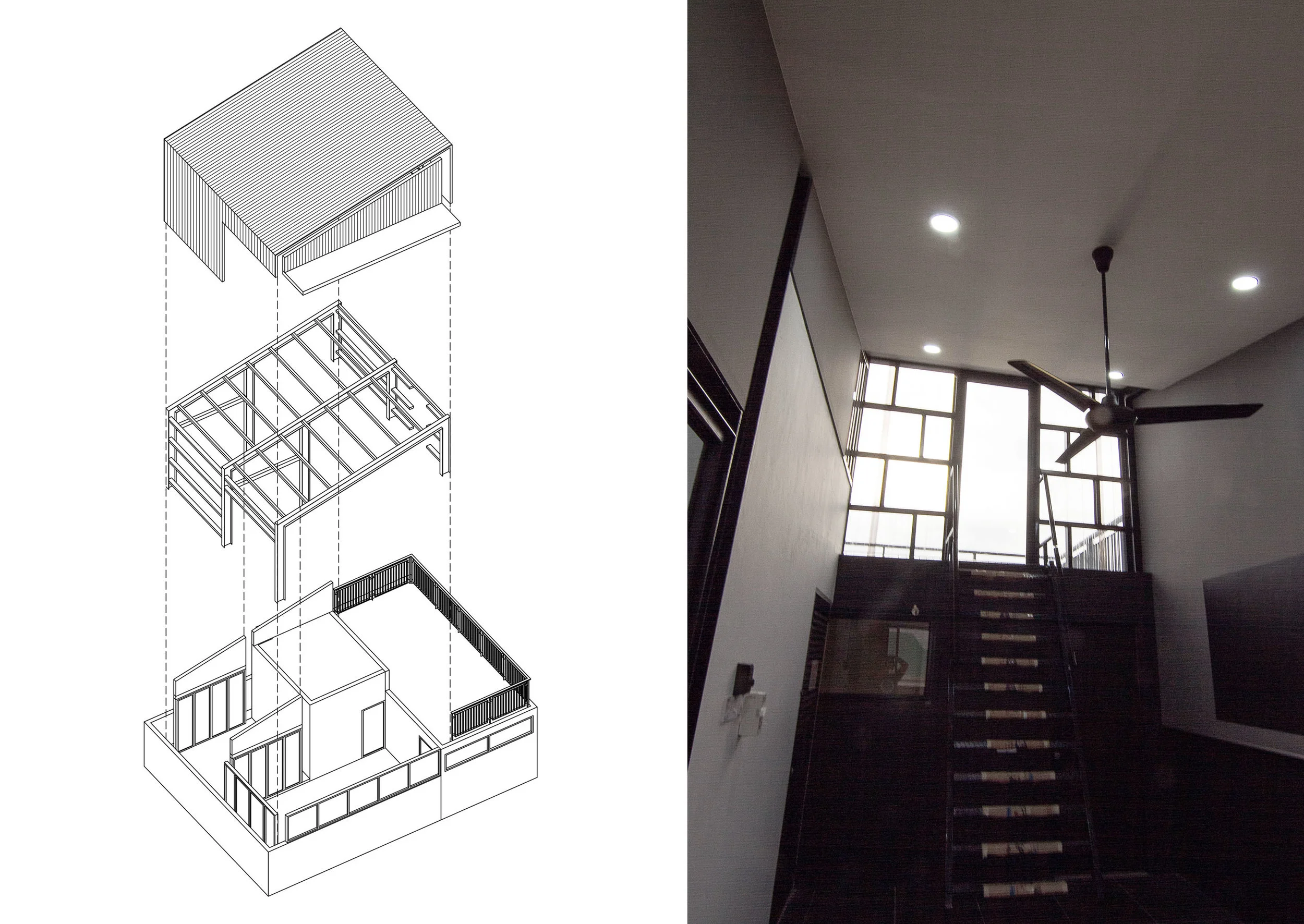
Small addition of rooftop workshop on 3-storey automobile paints showroom, which consists of a mini paint spraying booth, demo area and a viewing terrace.
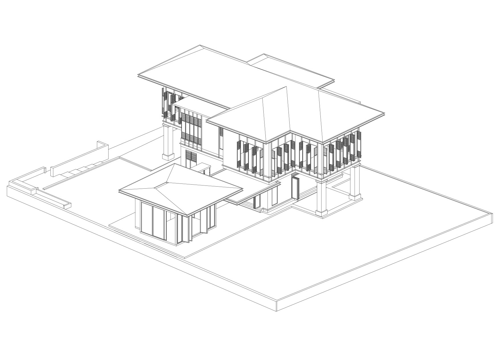
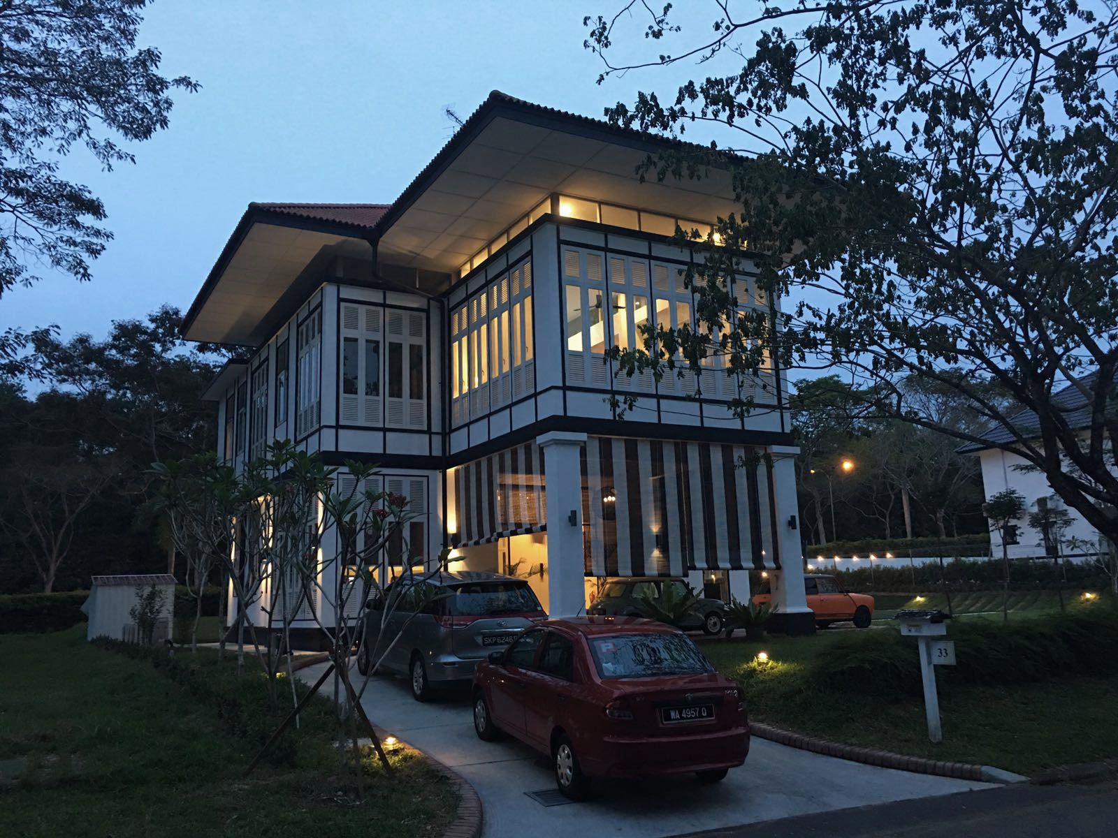
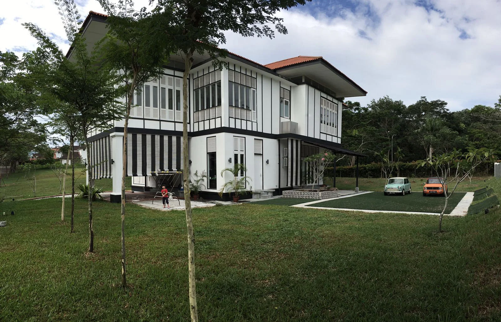
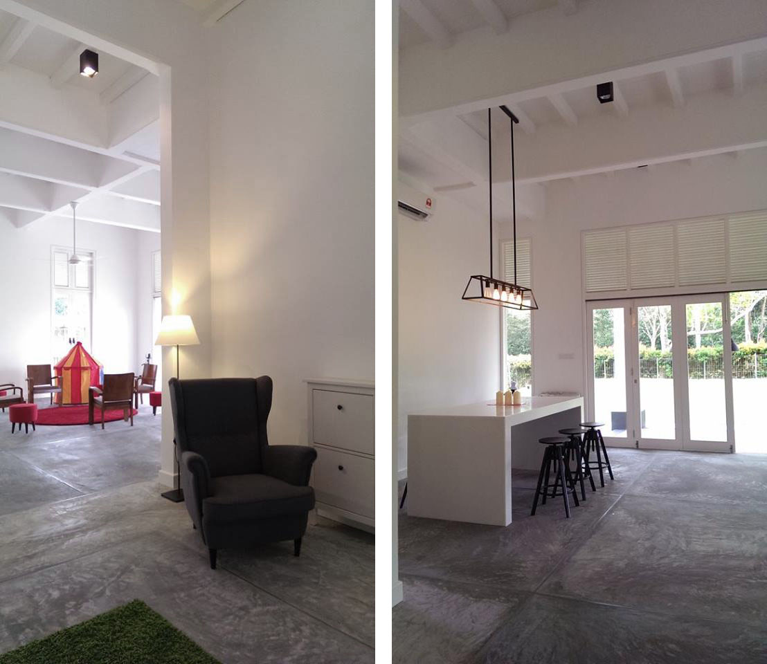
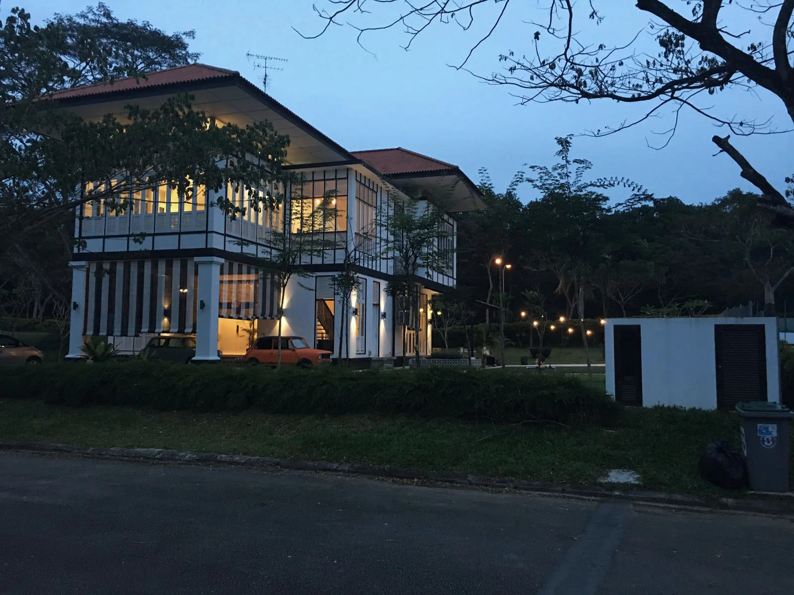
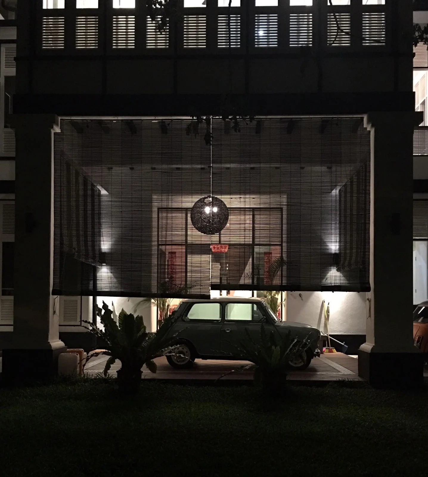
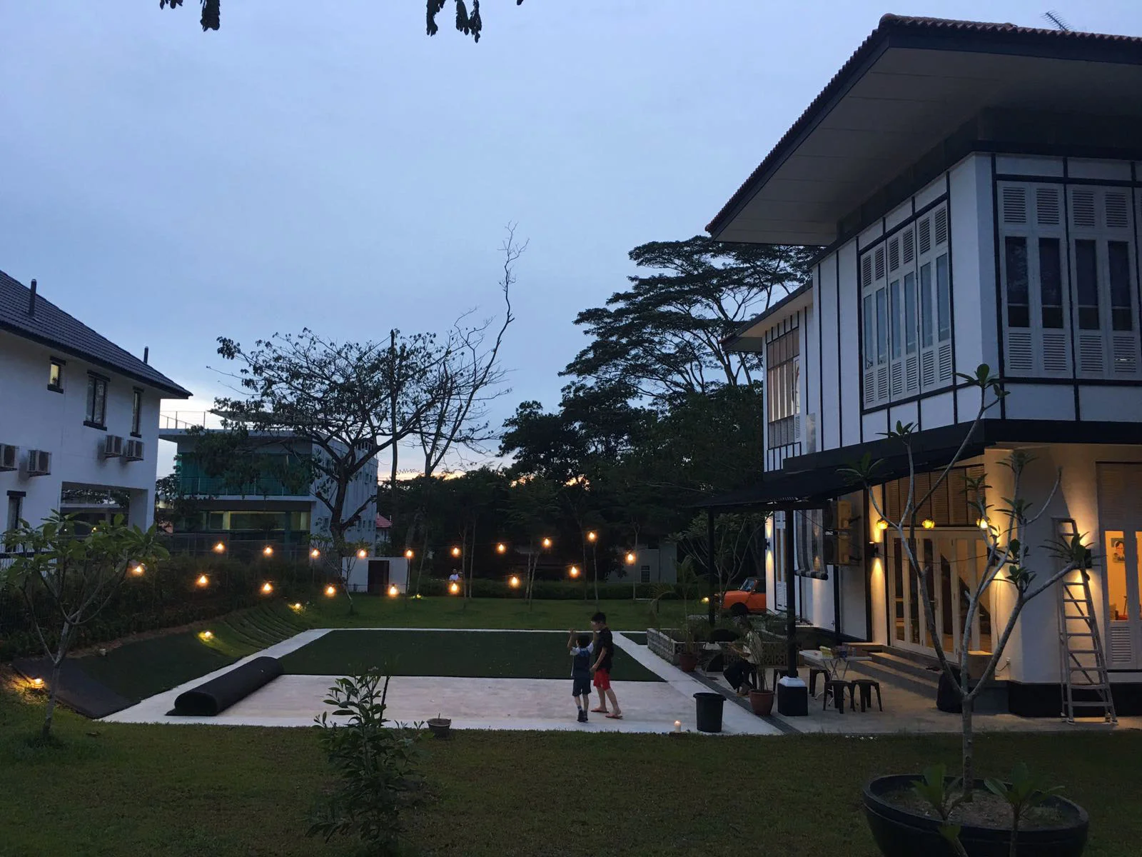
Black and White houses were colonial bungalows originally built by British colonialists in between the late 19th century up until pre-war era of 1930s. They were commonly used to house European colonial and wealthy expatriate families in the tropical climate colonies. The nickname, 'Black and White' refers to the dark timber beams and whitewashed walls, which usually found in these buildings. Generally, the design, sometimes referred to as Tudorbethan Style, combines Tropical and Art Deco elements with a traditional Victorian style home. (An extract from "A Brief History of Singapore’s Black and White Houses' by Prianka Ghosh)
Our client, and also my secondary school classmate, Justin Ho is a long admirer of this colonial typology; and wished to build a family getaway from Singapore. At the initial design stage, we researched its origin and visited some existing black and white houses in Singapore.
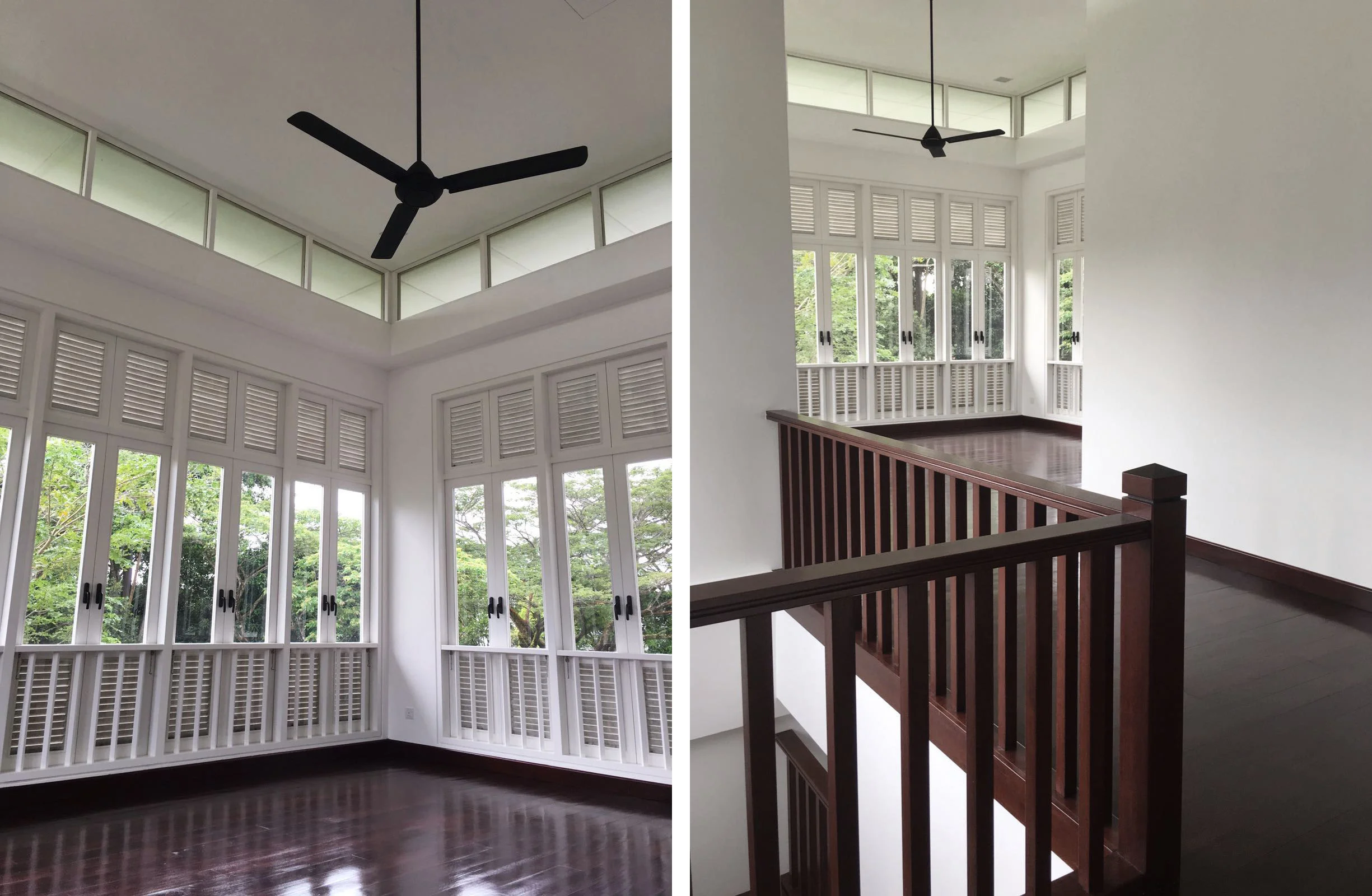
Our design strategy addressed its relevance in a modern context including construction methods, building materials and life style. We adopted many of the characteristics including the proportions and symmetry in layout and elevations, the spacious floor plans especially on the ground. Other elements of this typology are the sturdy columns defining the entrance, large verandas, pitched roofs with huge overhang, tall timber louvered windows and high ceilings.
Although this was a project that is uncommon to our design approach, it enabled us to learn about the design methodology of the original black and white house, with lessons about vernacular and tropical architecture.
(Text edited by PAMSC Intersection Editorial)